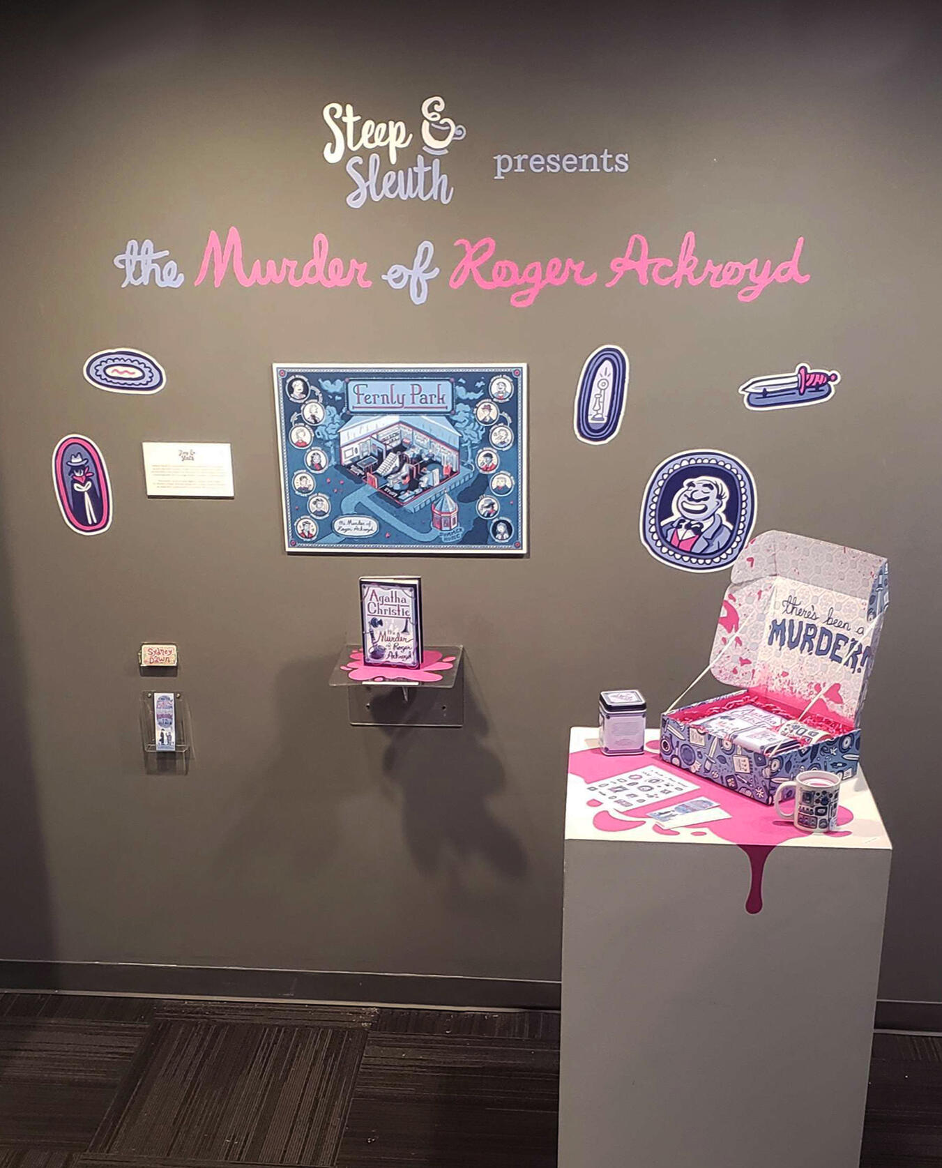
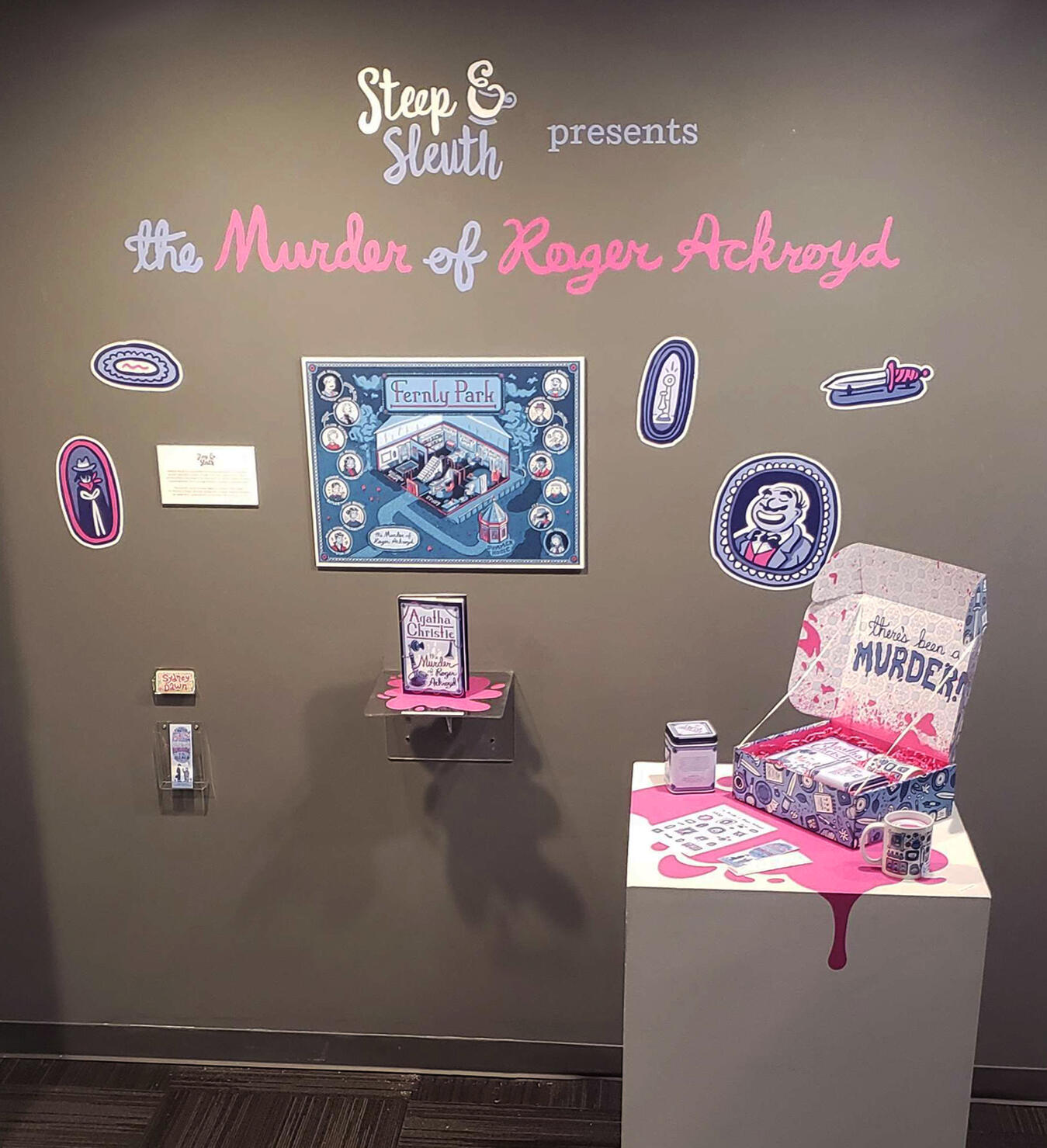
Steep & Sleuth presents
The Murder of Roger Ackroyd
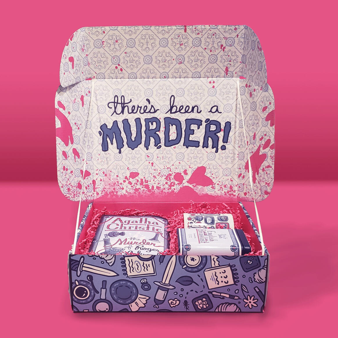
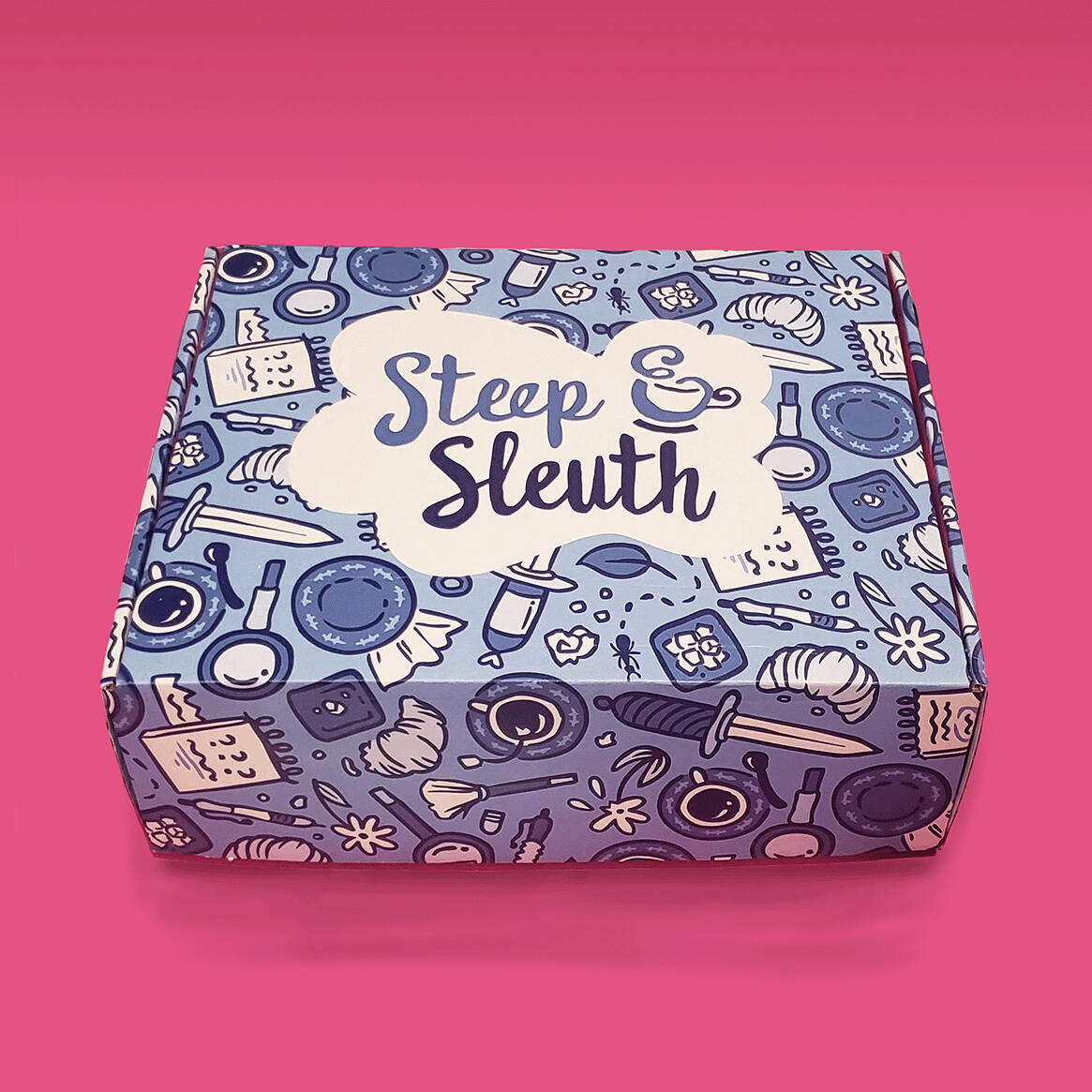
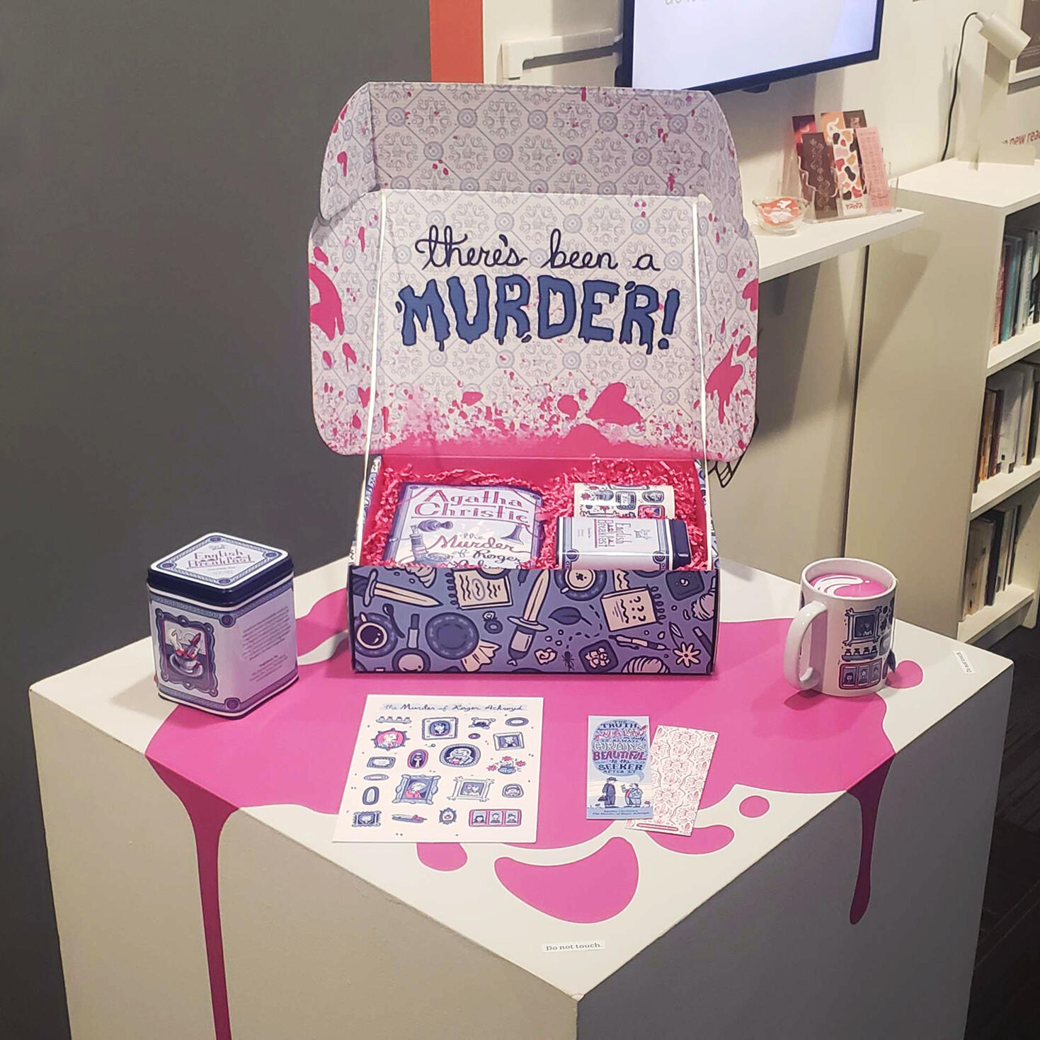
My senior thesis project at the Milwaukee Institute of Art & Design was Steep & Sleuth: a proposed book subscription service that paired mystery novels with quality teas. Each box would come with a new edition of the title and a tin of tea, along with other themed goodies, such as a mug, poster, bookmark, and stickers.This initial run showcased Agatha Christie’s 1926 classic,
The Murder of Roger Ackroyd, which follows Dr. James Sheppard as he investigates the titular Ackroyd's death with the help of famed detective Hercule Poirot. The story was paired with a classic English Breakfast tea made from leaves grown in Cornwall.
Box & Pattern Design
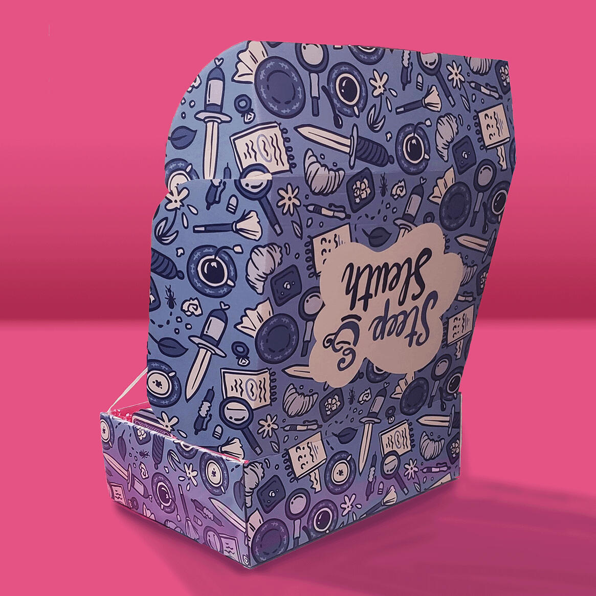
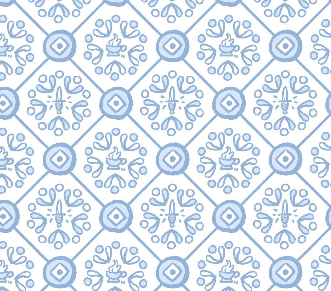
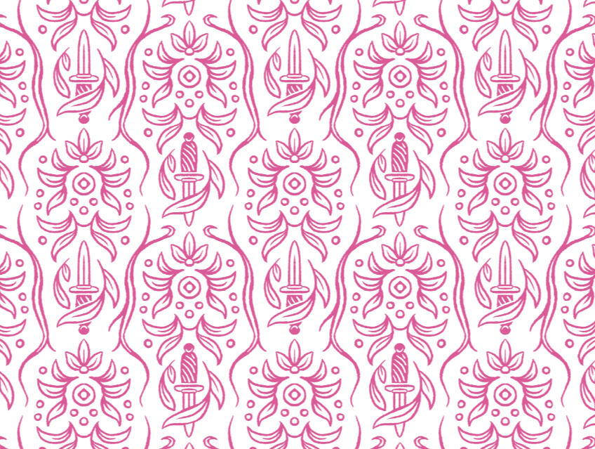
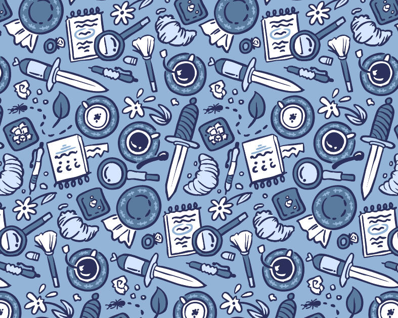
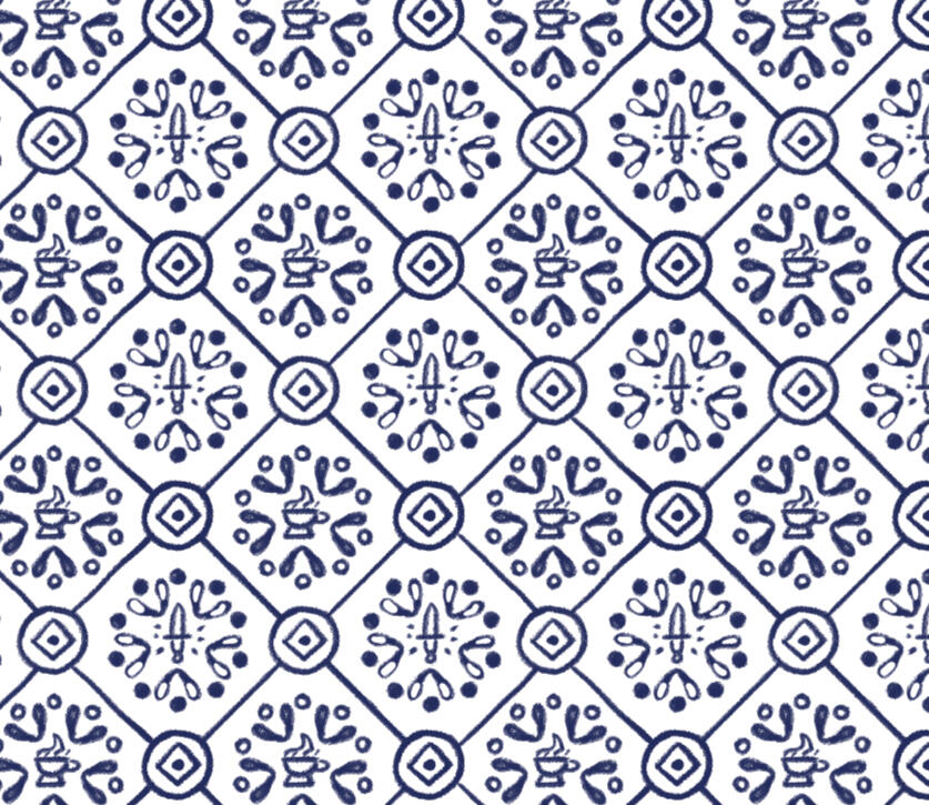
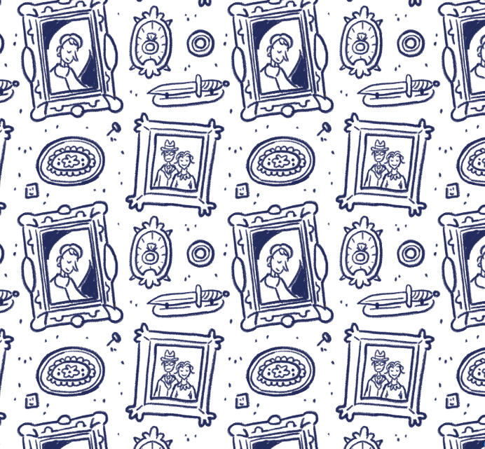
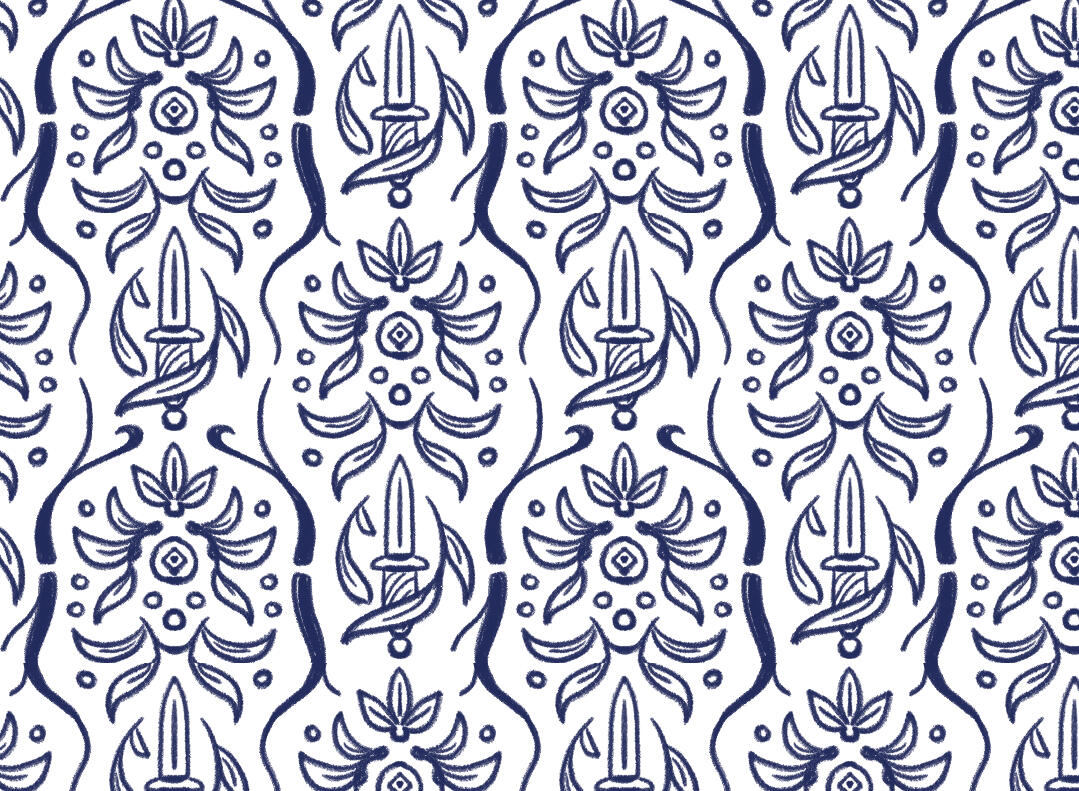
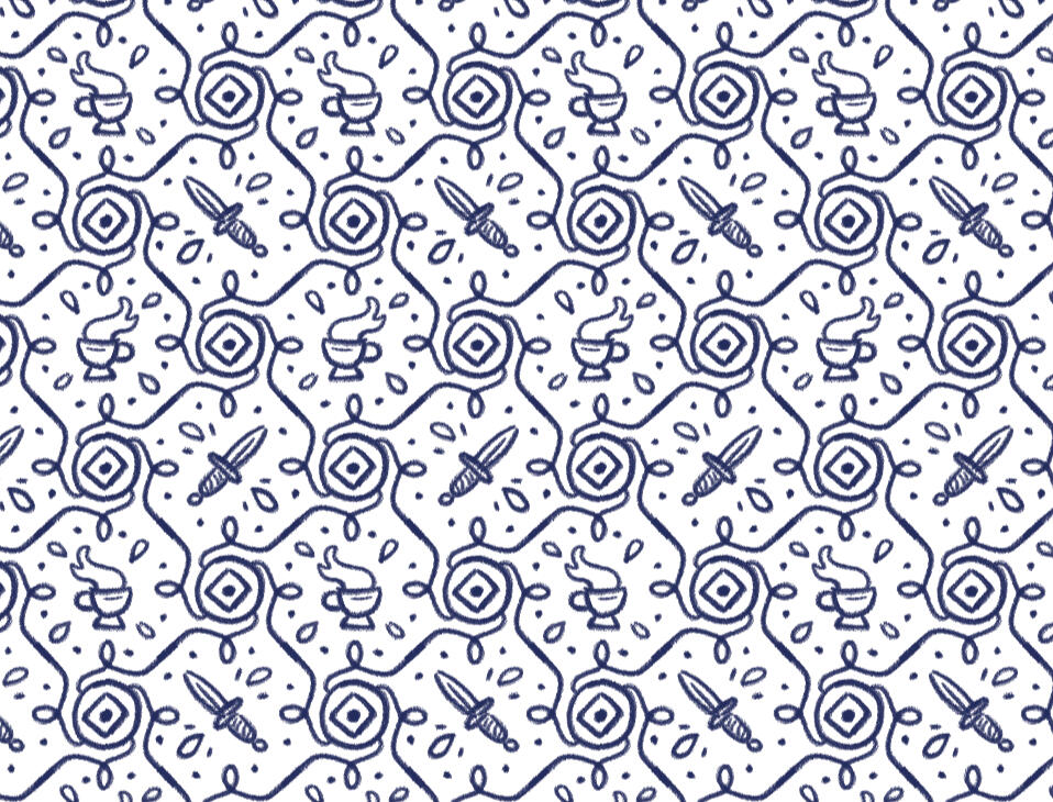
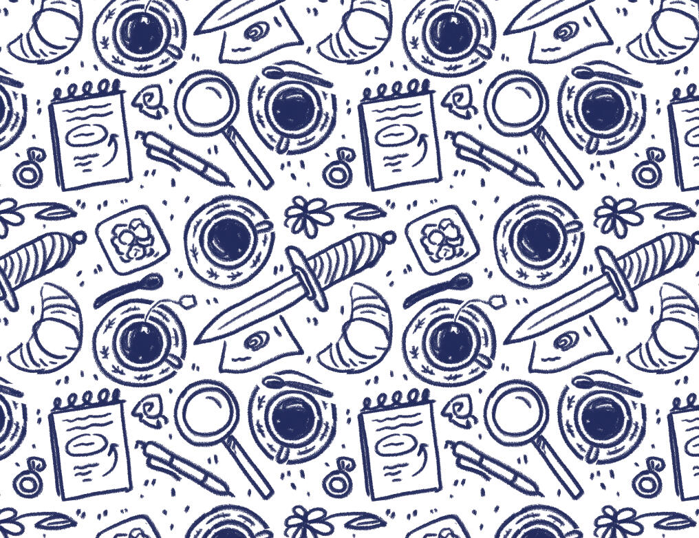
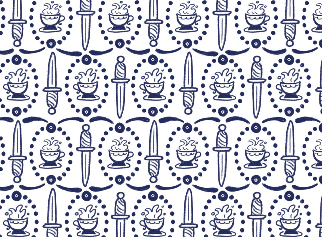
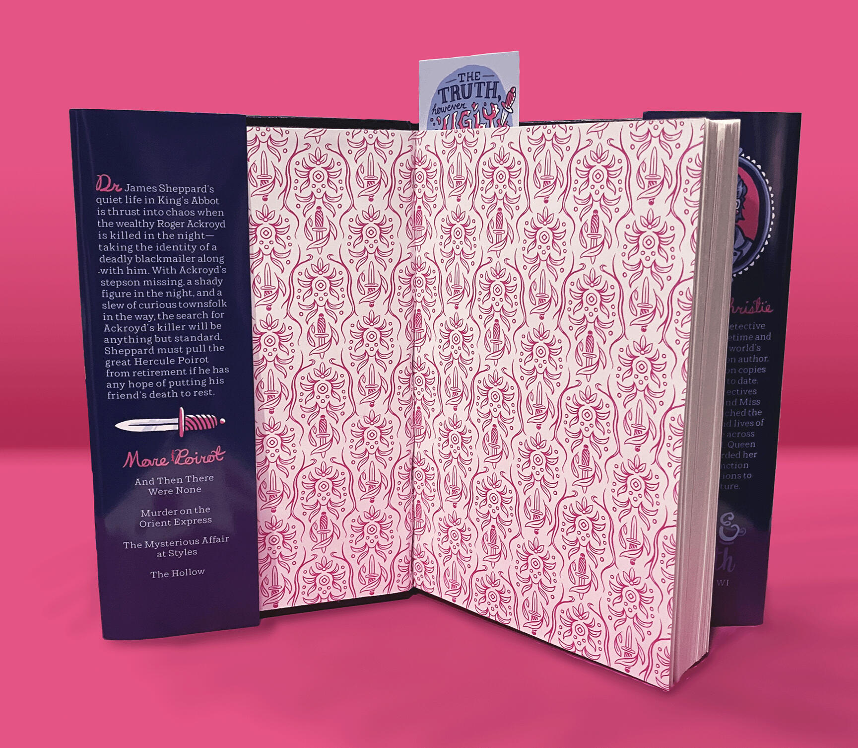
I developed a series of two patterns for the Steep & Sleuth mailer box, and took a third scrapped pattern to finish for endpapers inside the hardcover. I took inspiration from 1920s wallpaper patterns, giving them a modern twist focused on the combined theme of tea and murder mysteries.
Book Jacket Design
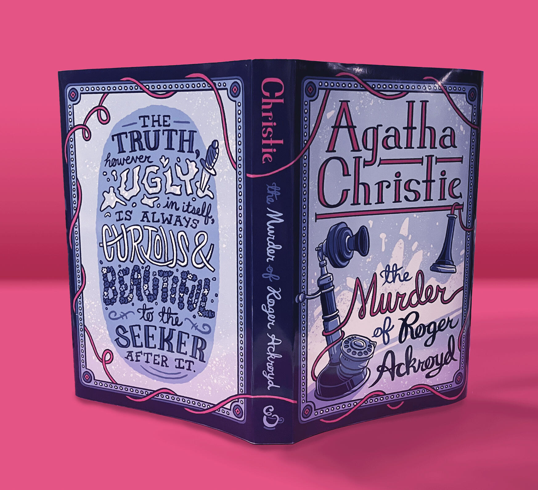
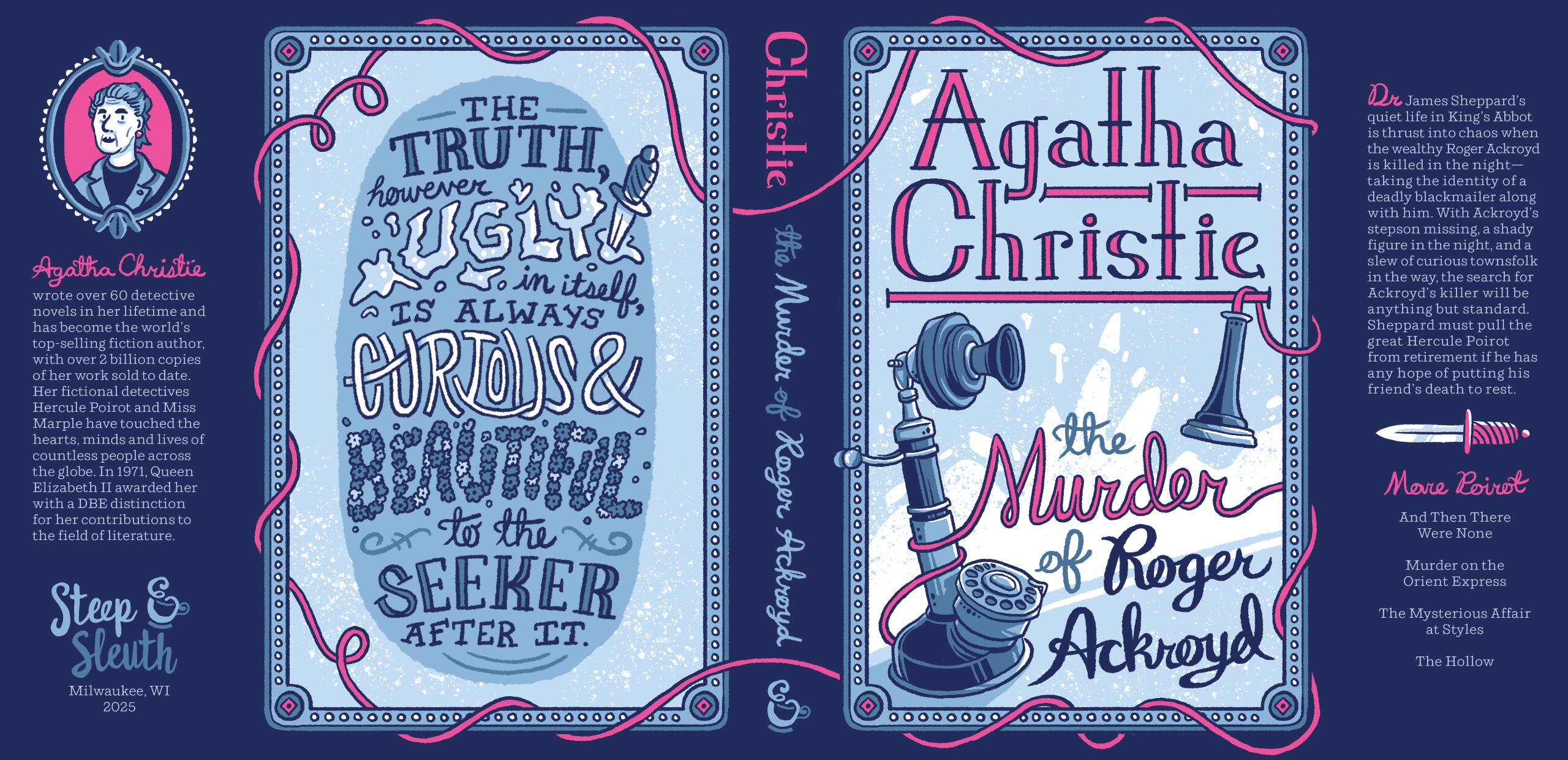
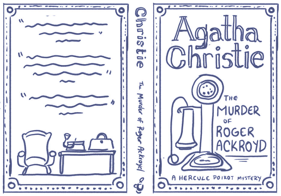
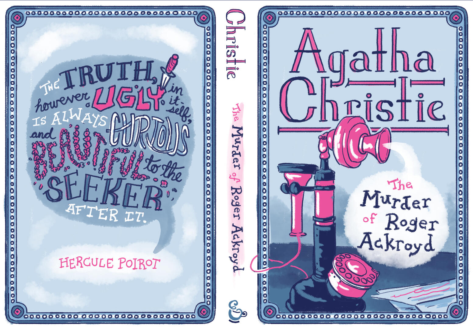
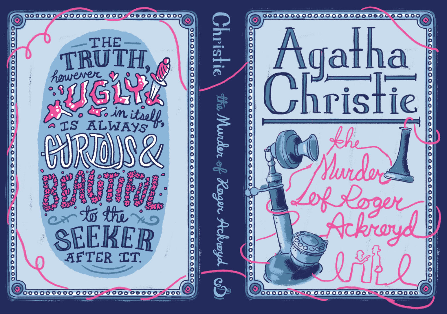
The dust jacket design focused on Ackroyd's candlestick telephone and the tangled web it weaves from cover to cover. Moody, desaturated blues were chosen to convey the darker subject matter of the book, along with pops of bright pink to add a playful twist on the bright red found on most murder mysteries (keeping true to the dry humor in Christie's work).
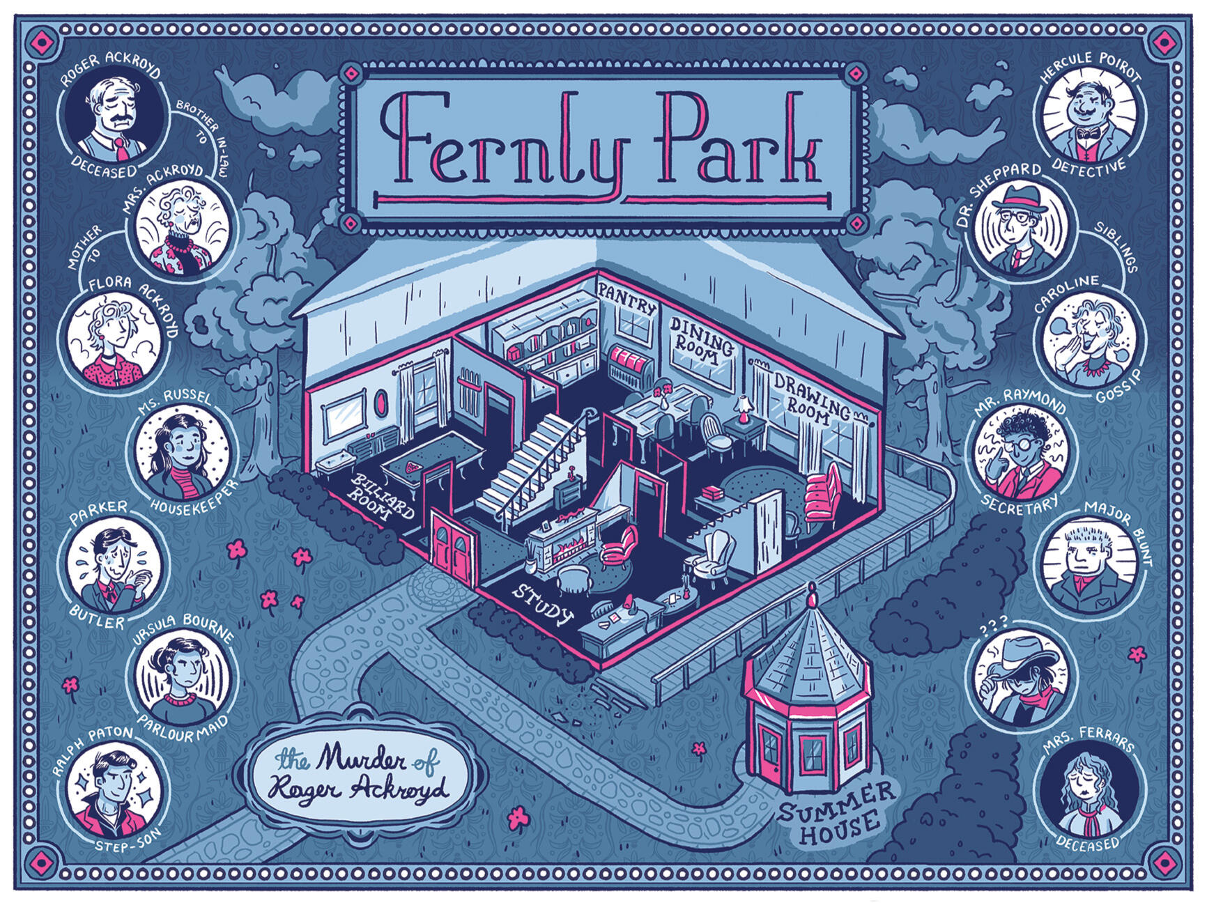
Map Poster
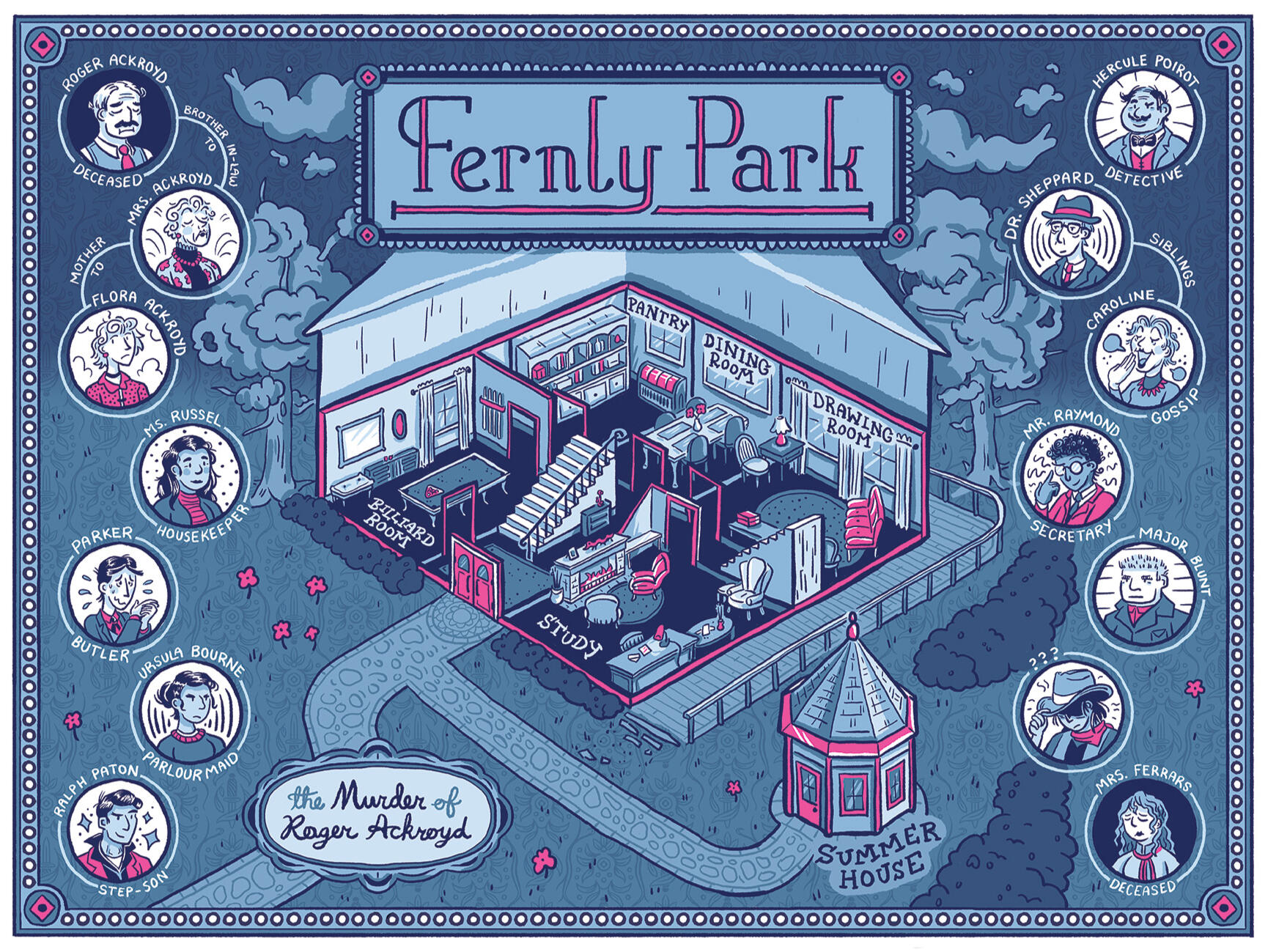
Fernly Park, Ackroyd's home estate, is the main setting for the mystery. This map showcases the first floor, with the room placement and Study furniture layout mirroring rudimentary maps featured in most printings of the novel. Additionally included are portraits of my interpretations of the main cast.
Tea Package Design
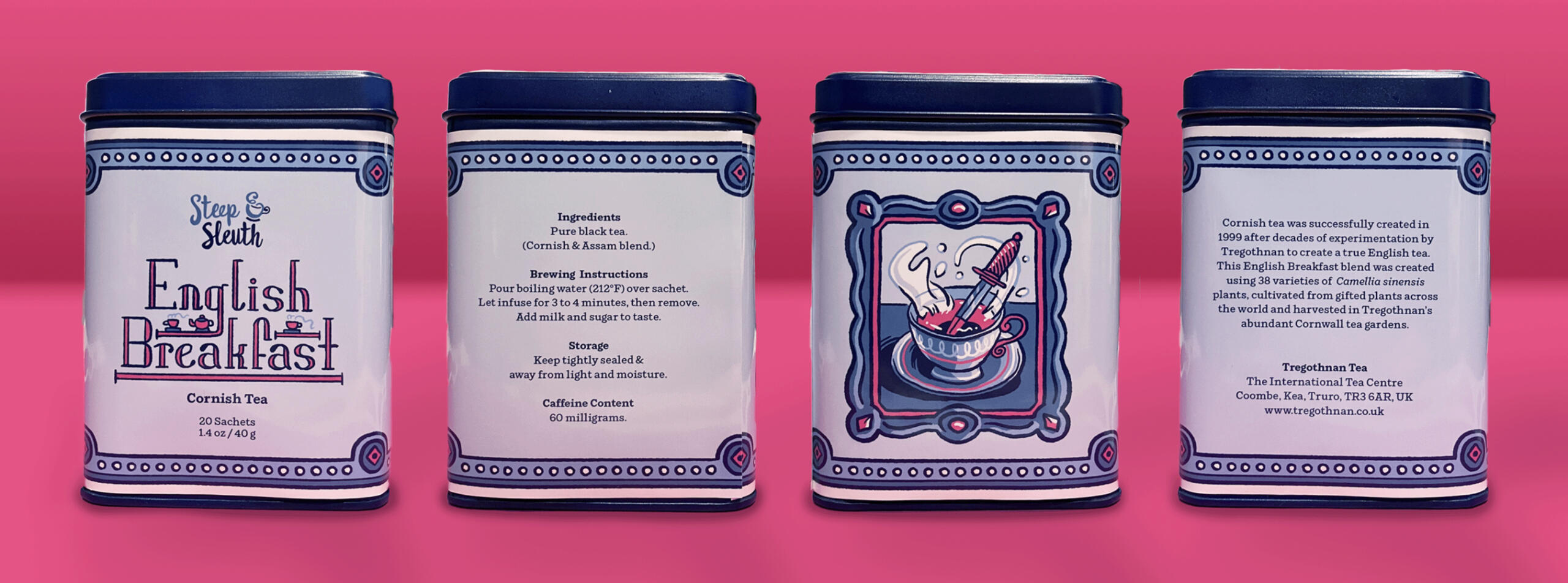
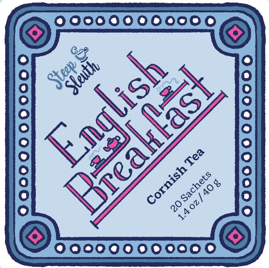
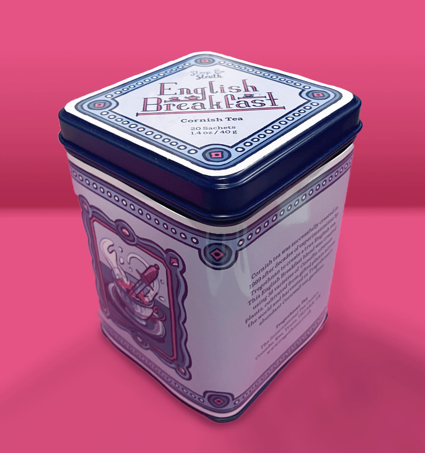
Paired with Christie's novel was a tin of English Breakfast tea. I couldn't include any real tea in the exhibition, but if I could have, it would have been made in Tregothnan's Cornish tea farms.
Mug Design
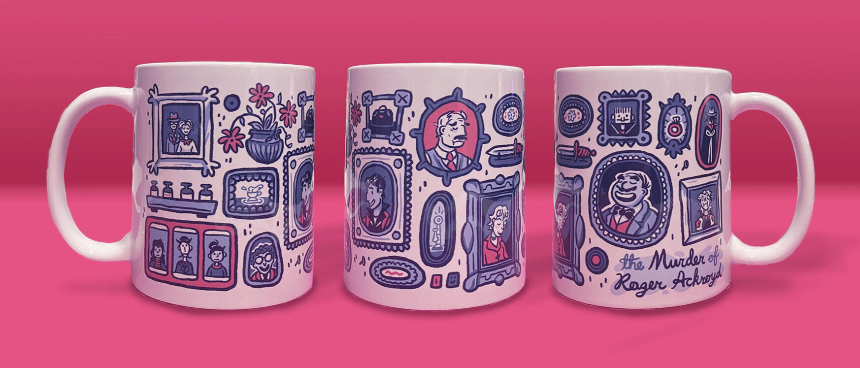
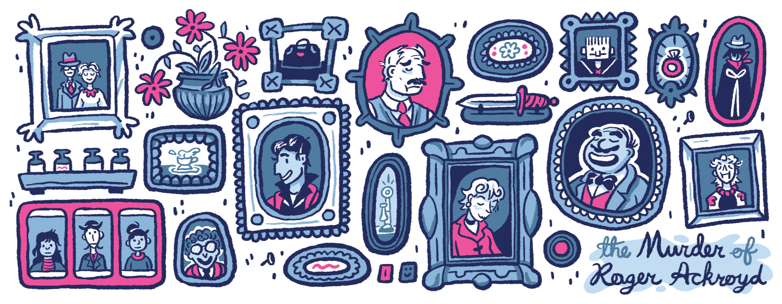
Calling back to framed elements in the rest of the series, the mug design features portraits of the main cast, as well as key items from the story. The pink paper insert & faux tea bag string served as packaging for the 20 copies of the mug that were produced to be sold at the thesis exhibition's pop-up shop.
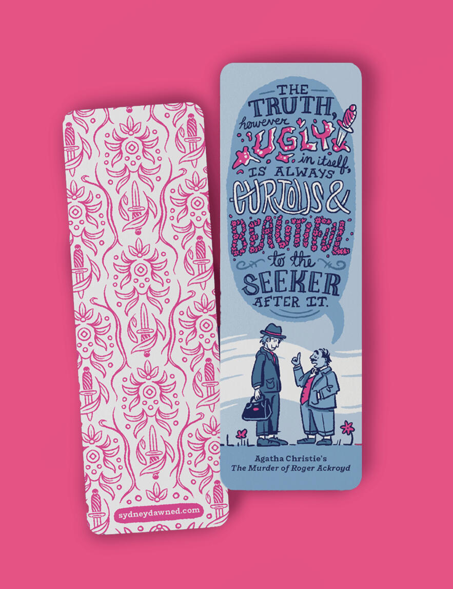
Bookmarks & Stickers
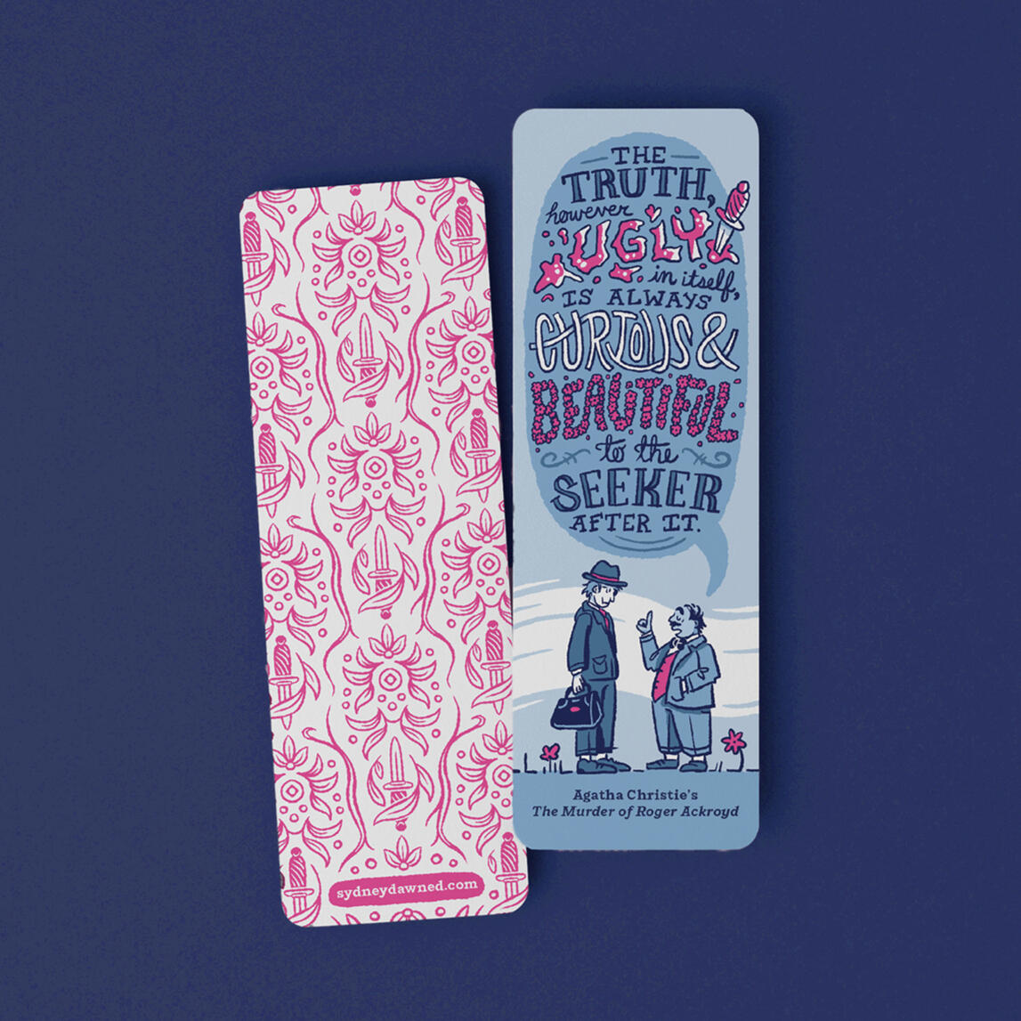
I repurposed assets from the set to create a bookmark and kiss-cut sticker sheet to include in the box. 250 copies of the bookmarks were handed out as free goodies at the exhibition.
Exhibition Space
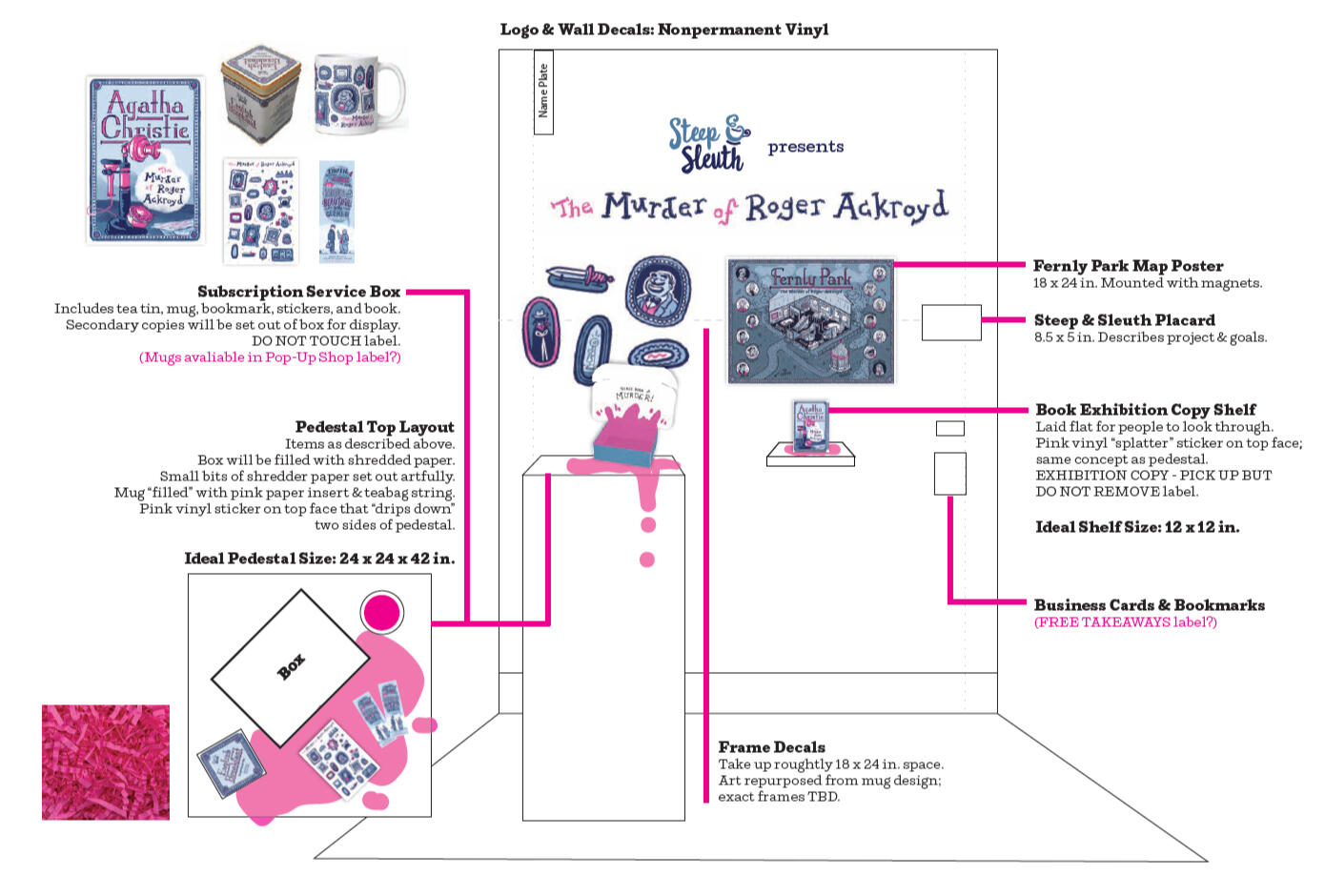
Though this project gave me many new challenges with the wide array of physical objects I had to produce, the largest of these hurdles was designing and installing the physical exhibition space. Though the dark grey walls of my assigned space threw me a bit of a curveball, they allowed me to lean into the darker themes of my work and create a stronger experience for visitors.
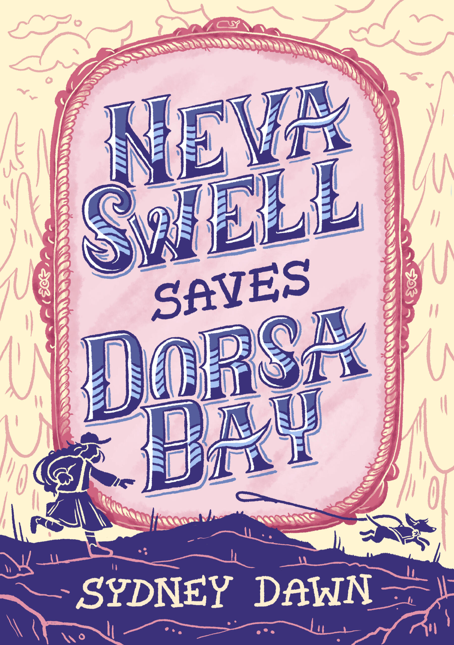
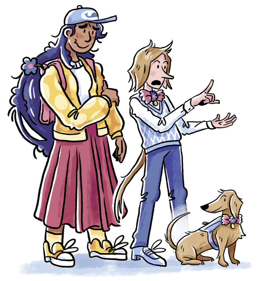
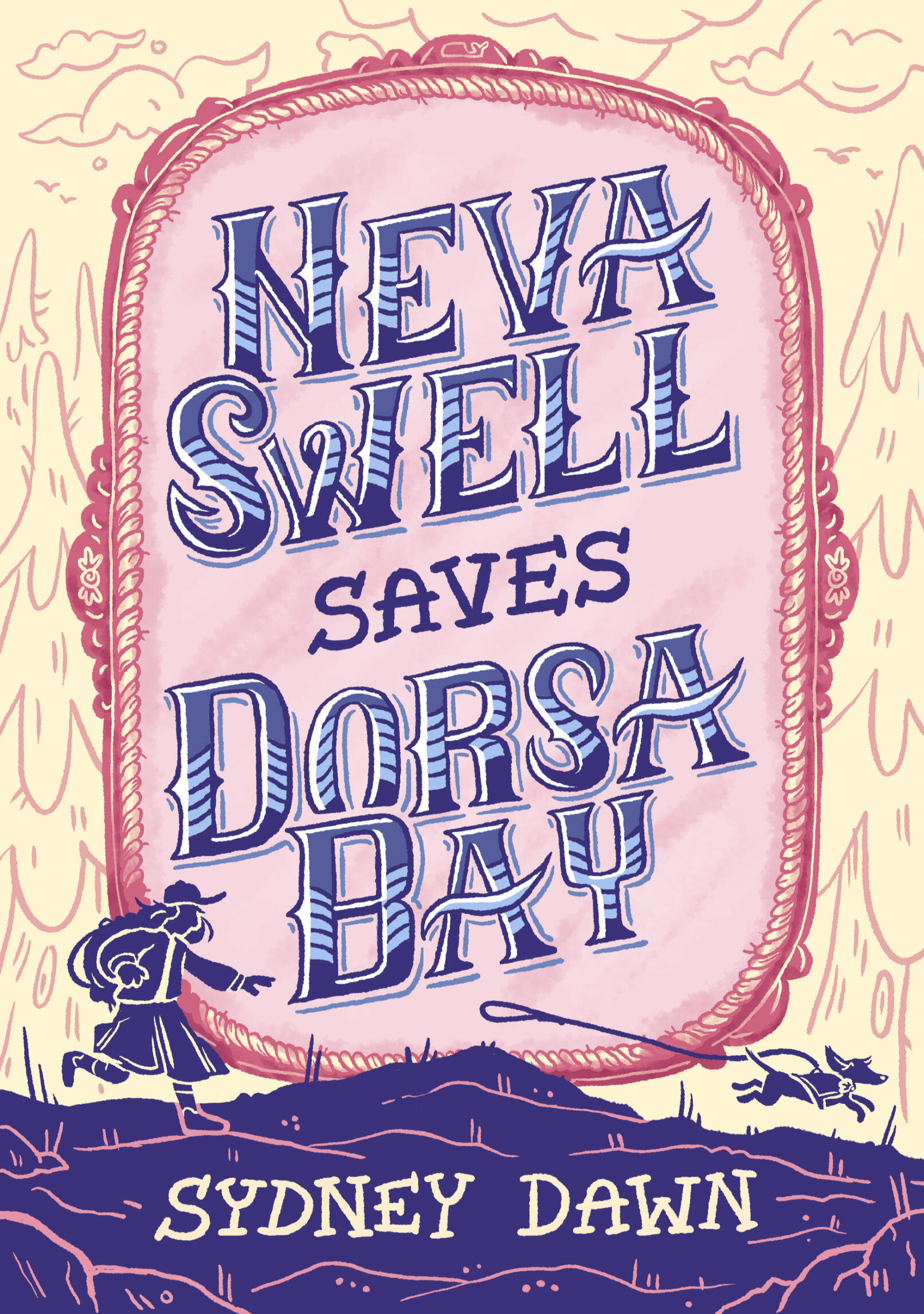
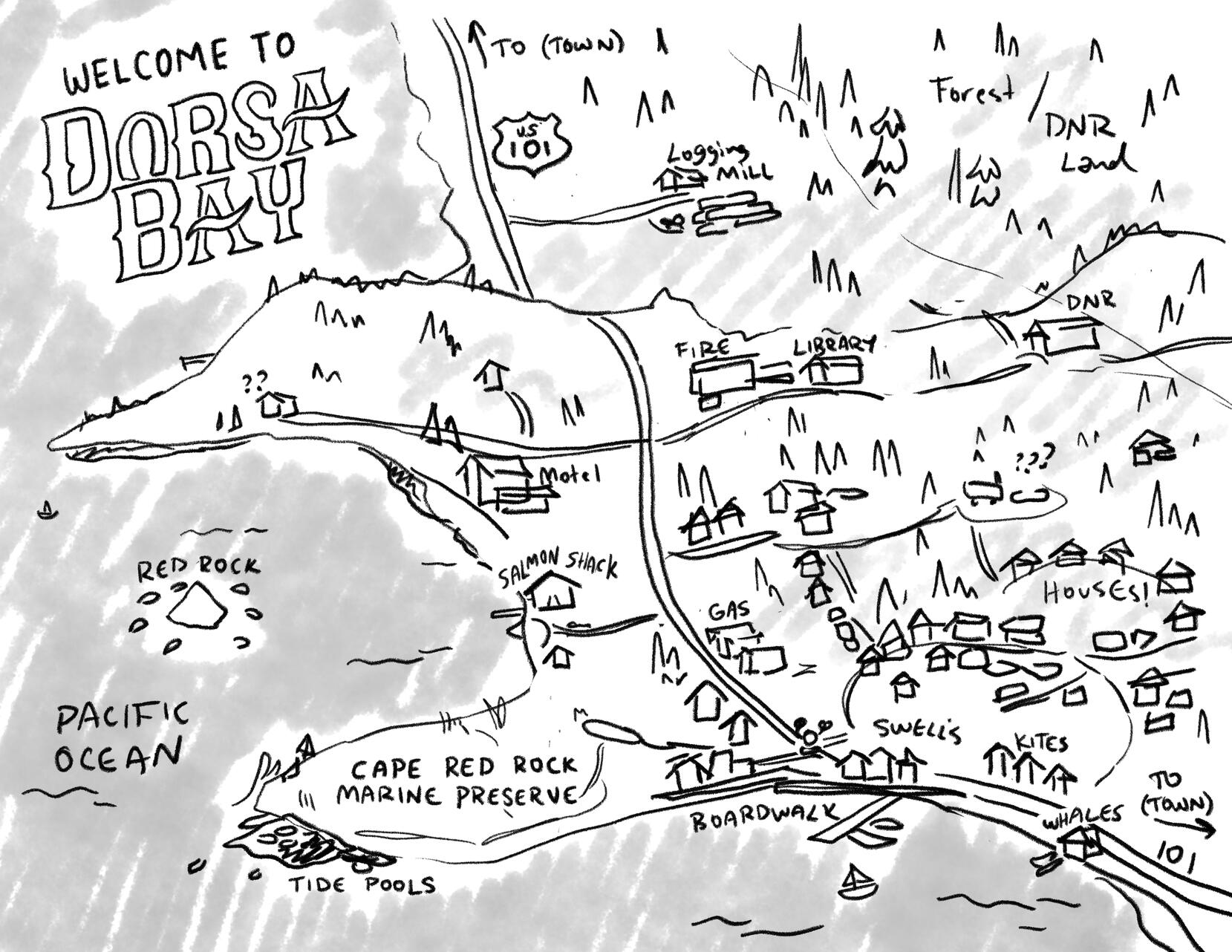
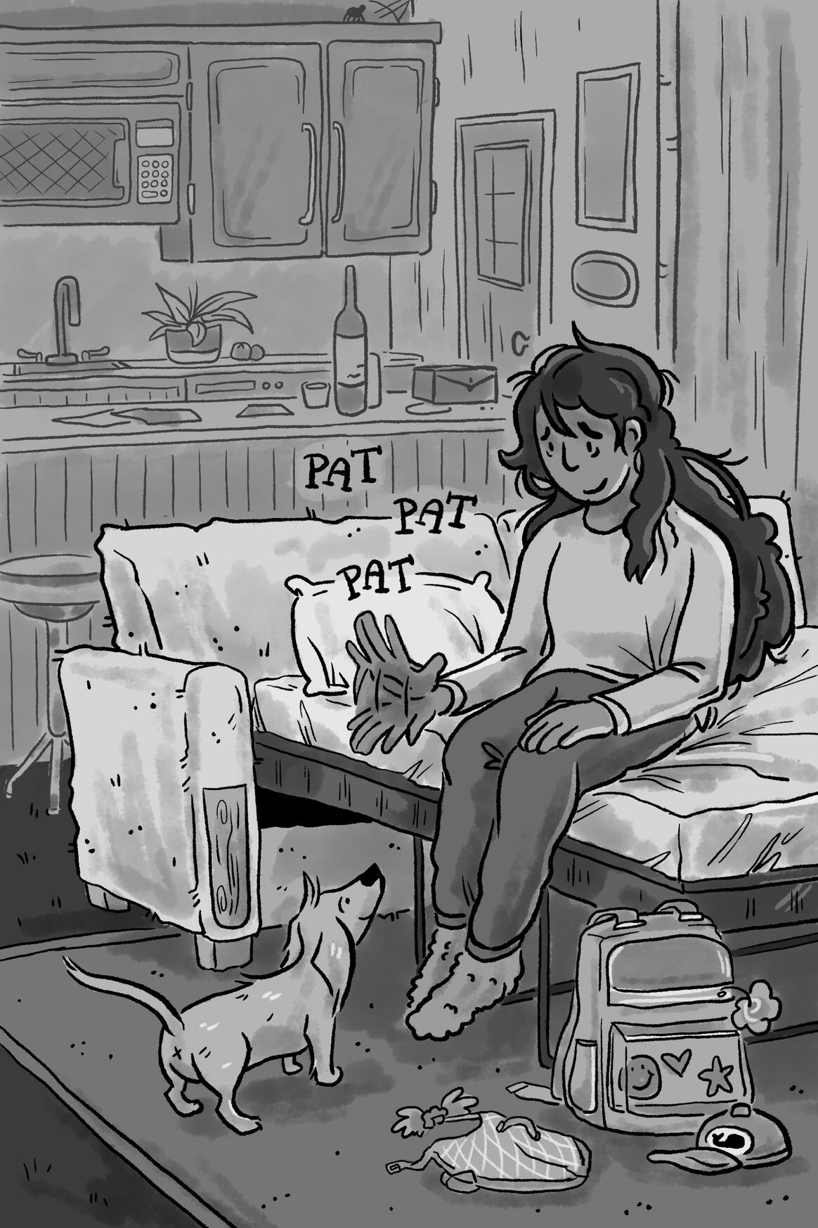
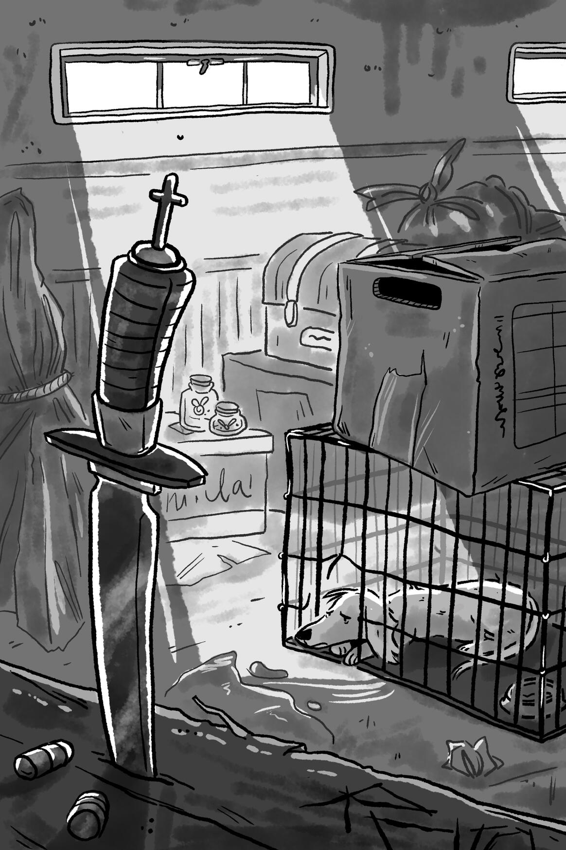
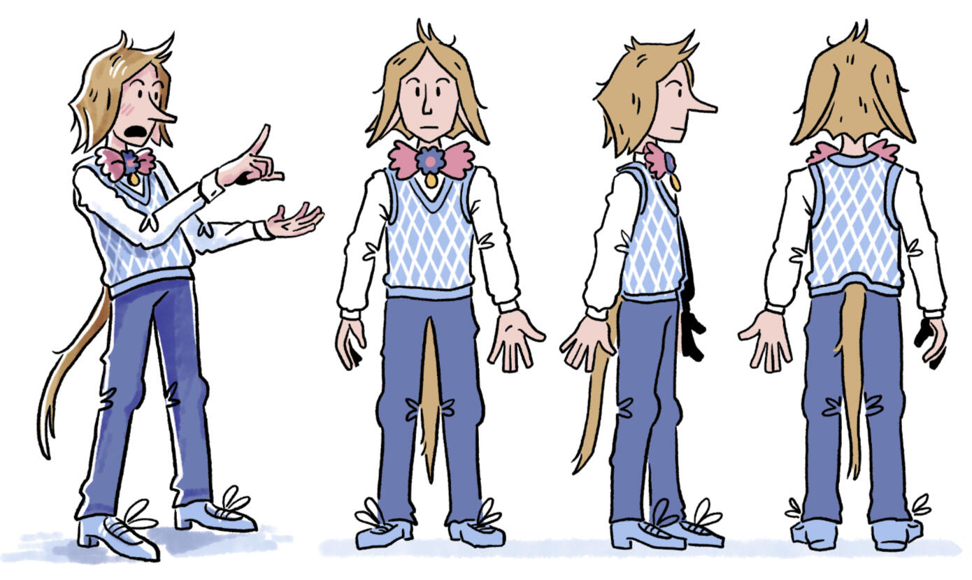
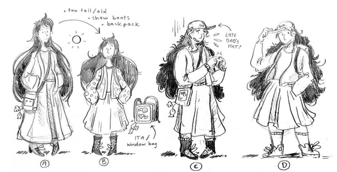
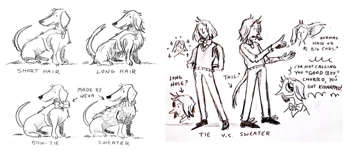
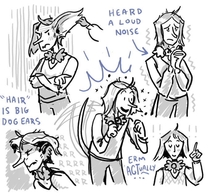
Neva Swell Saves Dorsa Bay is the working title for my illustrated YA novel about community, anxiety, and finding out that your dog is actually a reverse-werewolf who runs a local cryptid book club.
I started work in 2024 as part of a creative project development class in university. Though I'm only in the early stages of writing, I've developed a large body of illustration work for the project.
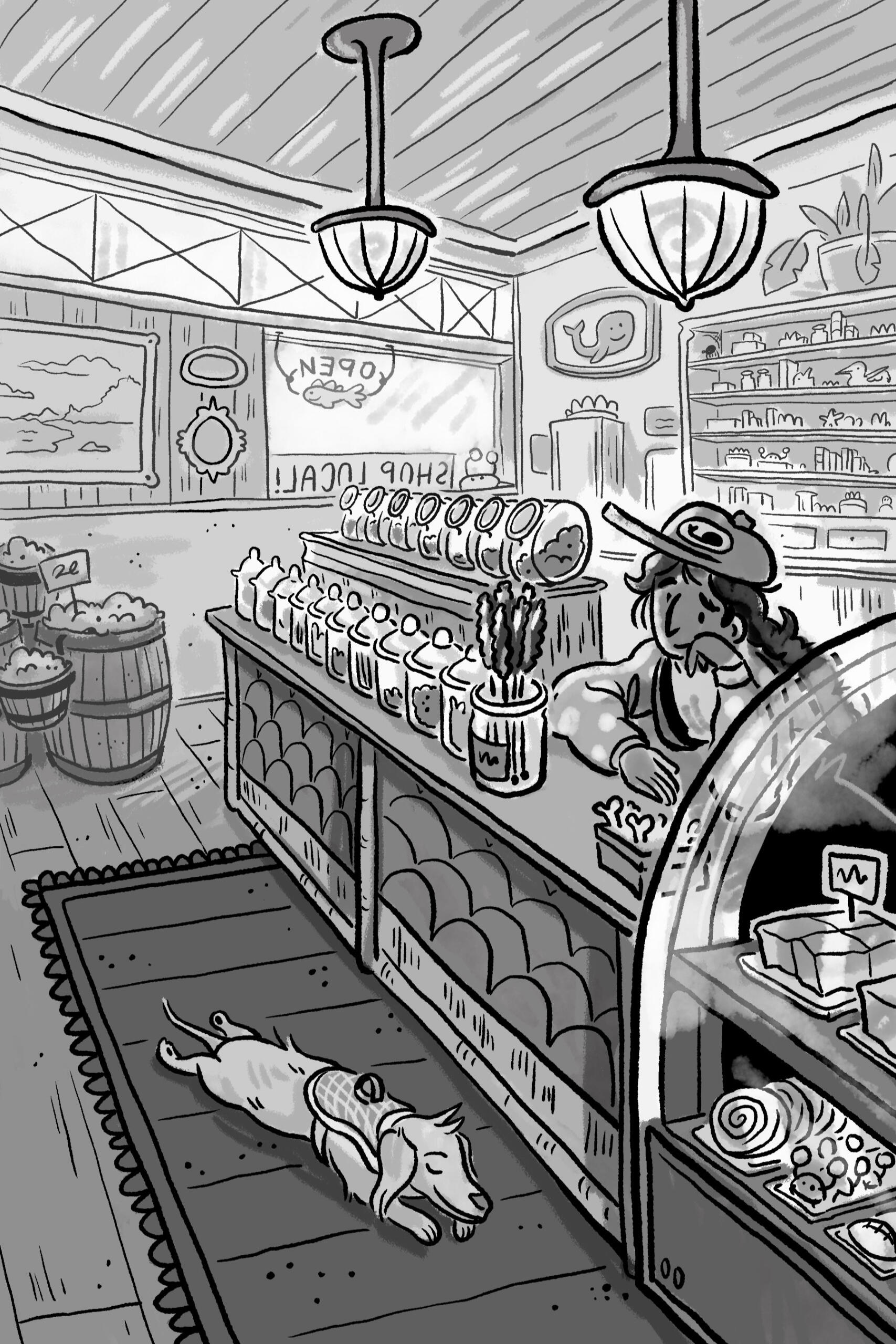
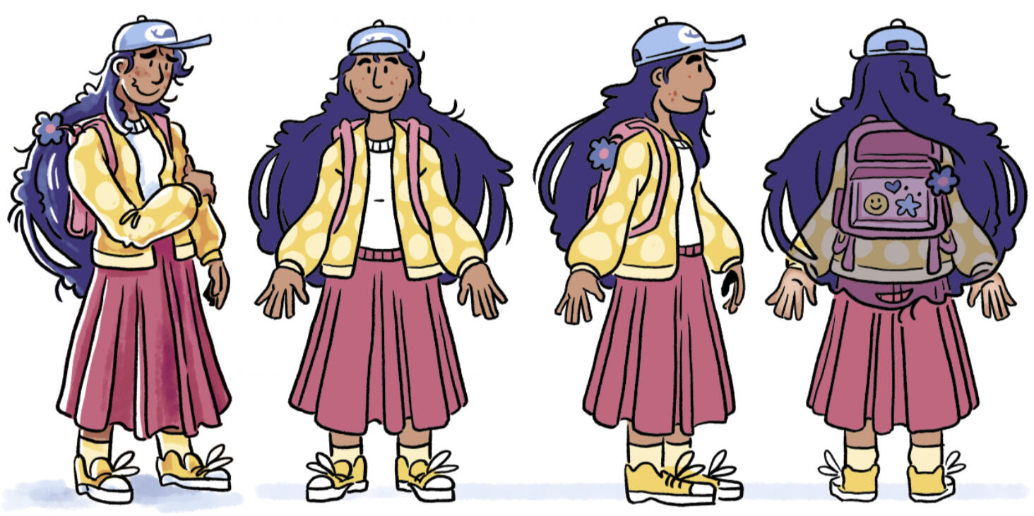
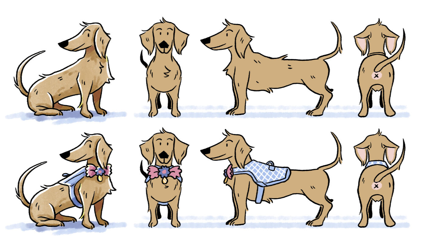
Neva is a 15-year-old girl living in Dorsa Bay, WA: a coastal tourist town which draws folks around the world with its rumors of cryptids and monsters. Though she often pretends she's not afraid of the local folklore, she's proud of her home town and loves to help out where she can. She works part-time at her family's candy store and keeps a tight (if shaky) leash on her escape artist dachshund, Churro.

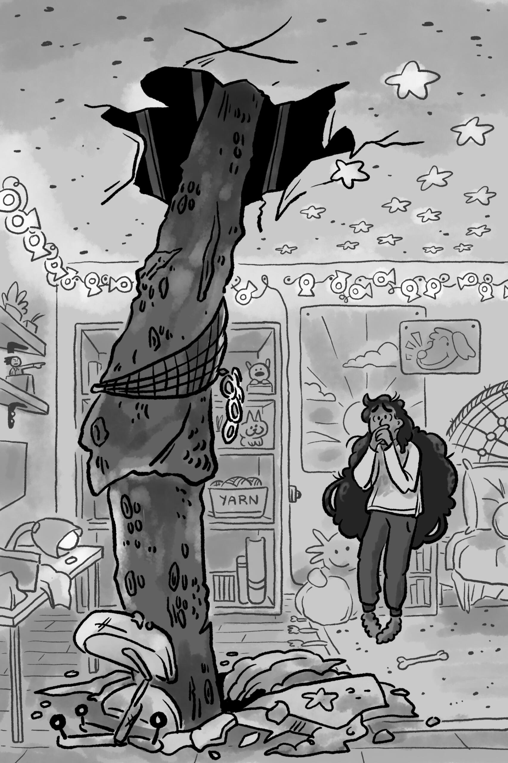
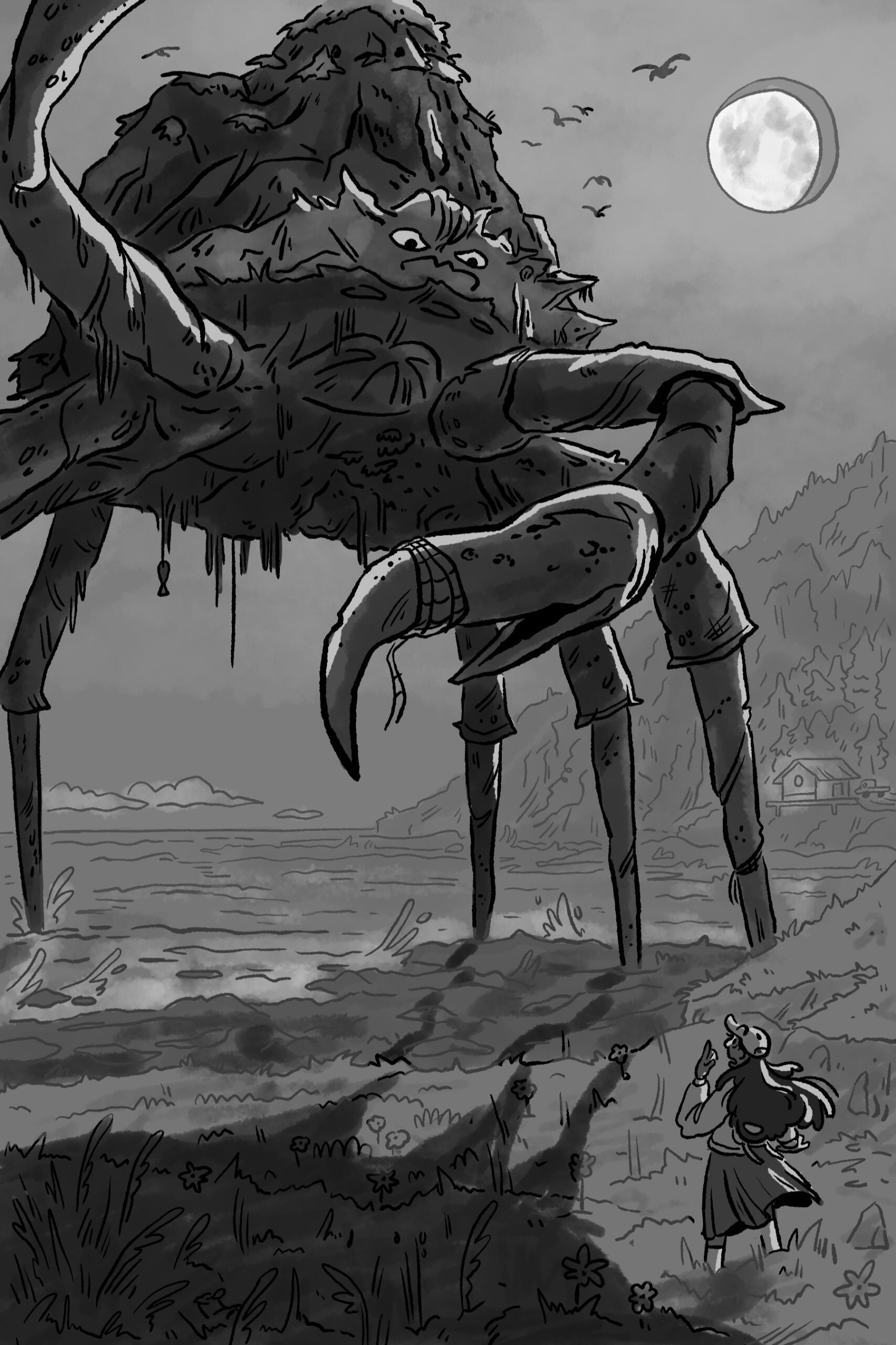
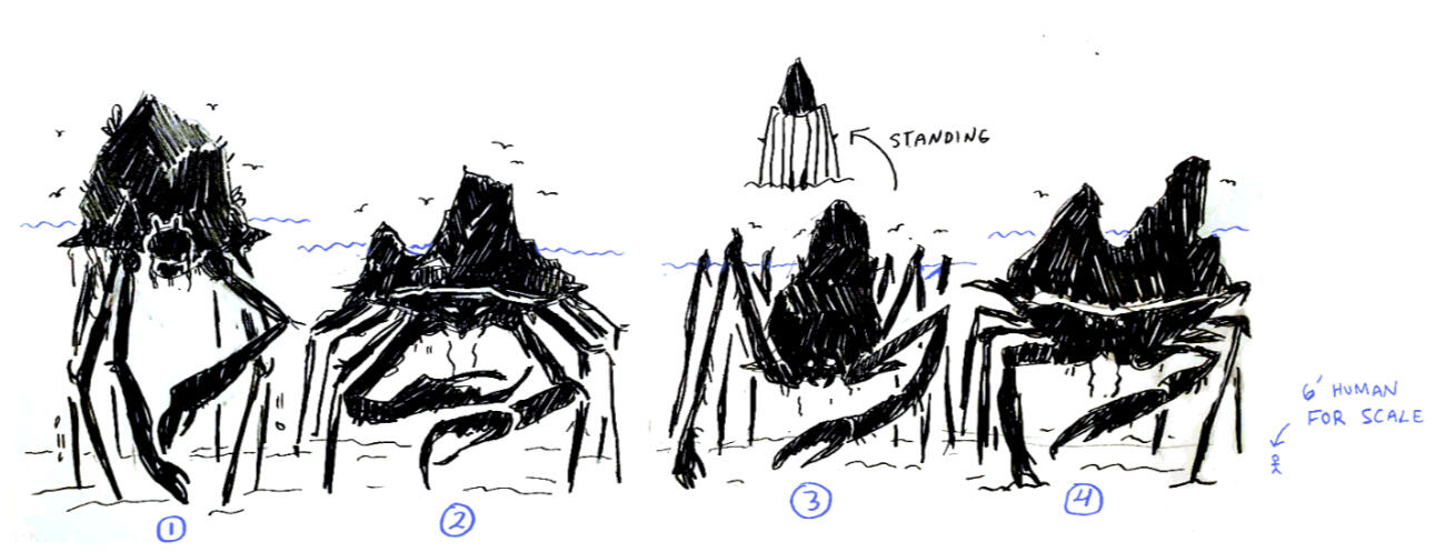
Neva's life is upended when a large coastal rock raises out of the ocean and reveals itself to be the shell of a giant crab monster. The monster smashes through the Swell's store and second-floor apartment, displacing Neva's family. Even worse, Churro has run away in the chaos. As news stations and tourists from across the nation appear to catch footage of the giant crab, no one has time to help Neva find her best friend... except for Vanessa Helsing, an internet-famous monster hunter who agrees to find Churro, fund the candy store's repairs, and kill the crab monster in exchange for the Swell's local experience.
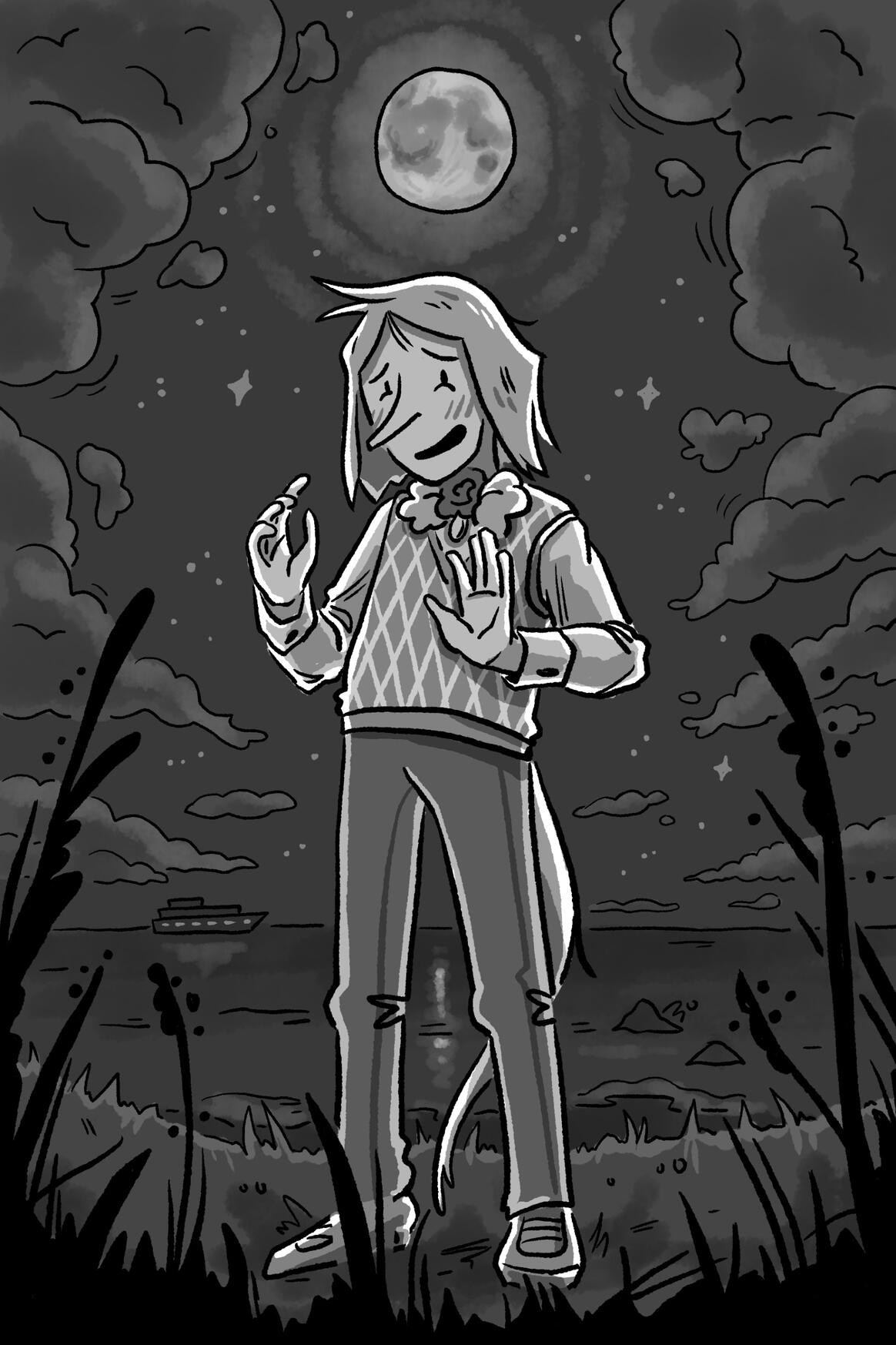
Two nights after the crab attack, a mysterious, well-spoken young boy appears at Neva's temporary home, claiming to be—Churro?! Apparently, while he's a normal dog by day, by the light of the moon, he turns into the world's most horrific beast: a human. He's "terribly sorry" he didn't tell her before, but he needs her help: monster hunters are close to finding Dorsa Bay's hidden cryptid community, and they need a trustworthy human to aid their escape. Now Neva must live a double life, hunting monsters by day with Vanessa and saving them by night with Churro.

Ravenskeep Concepts
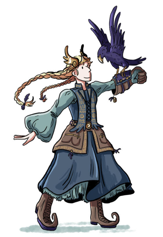
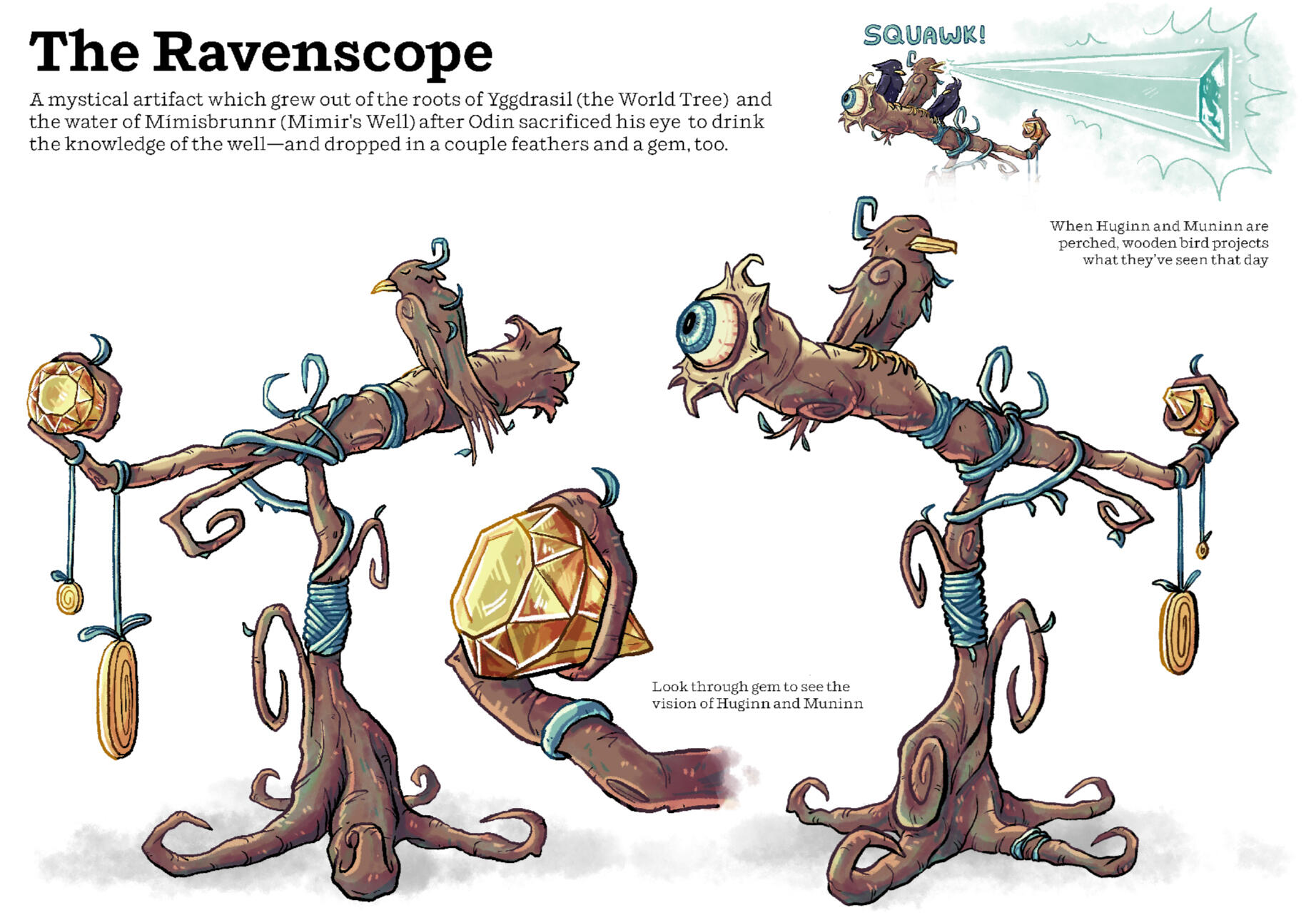
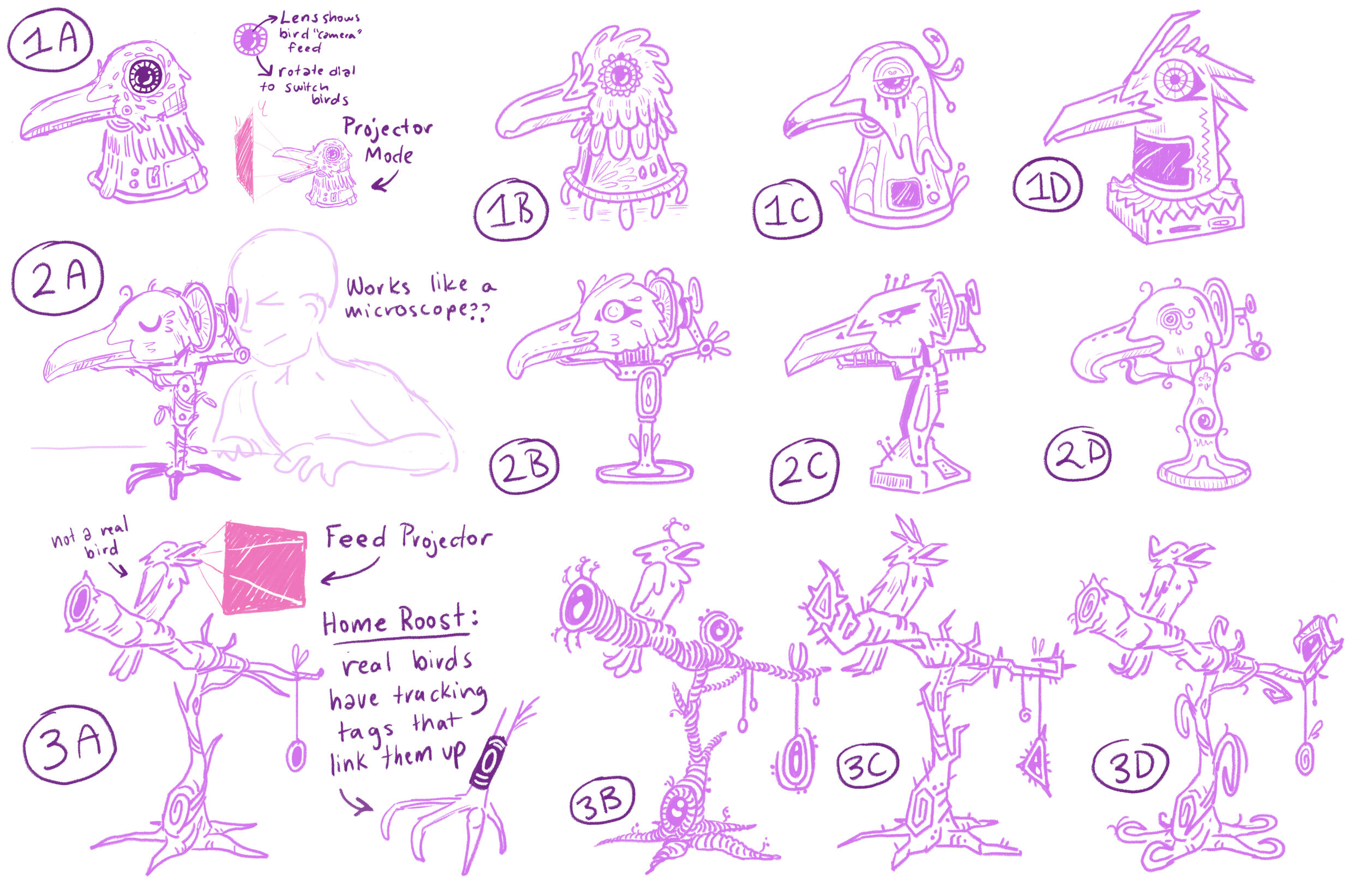
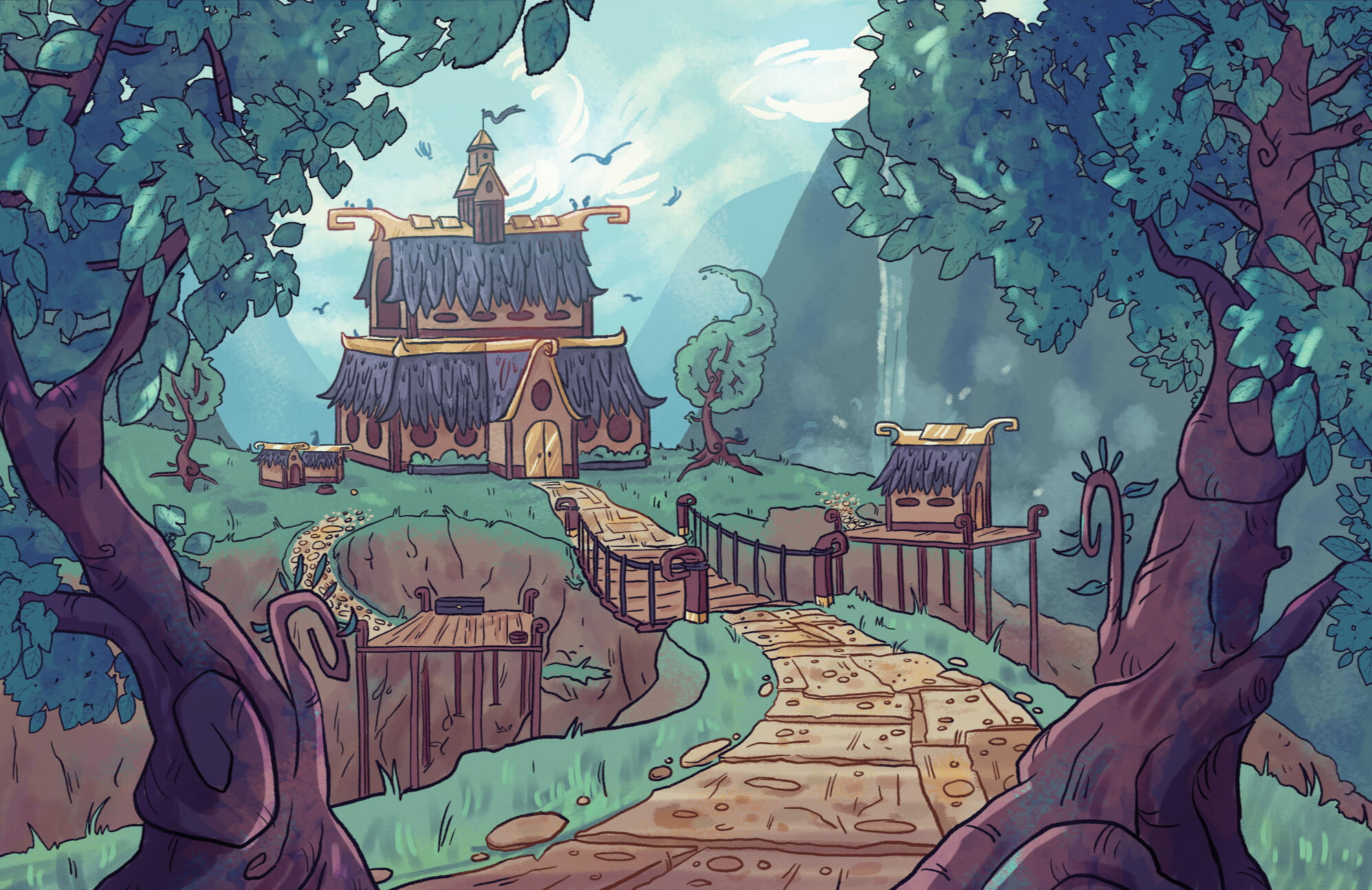
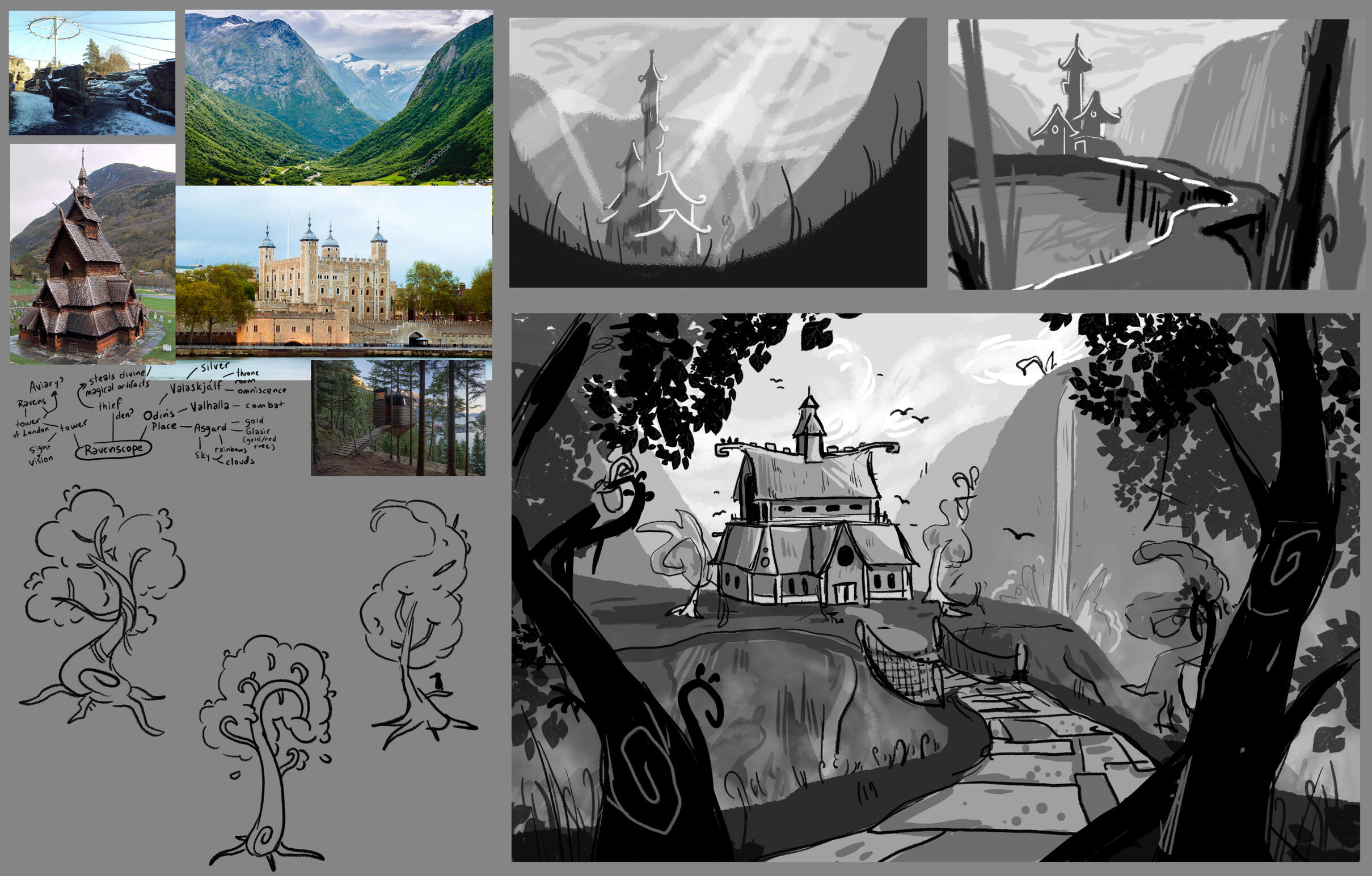
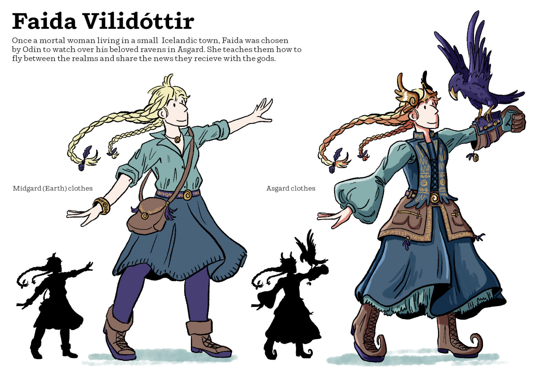
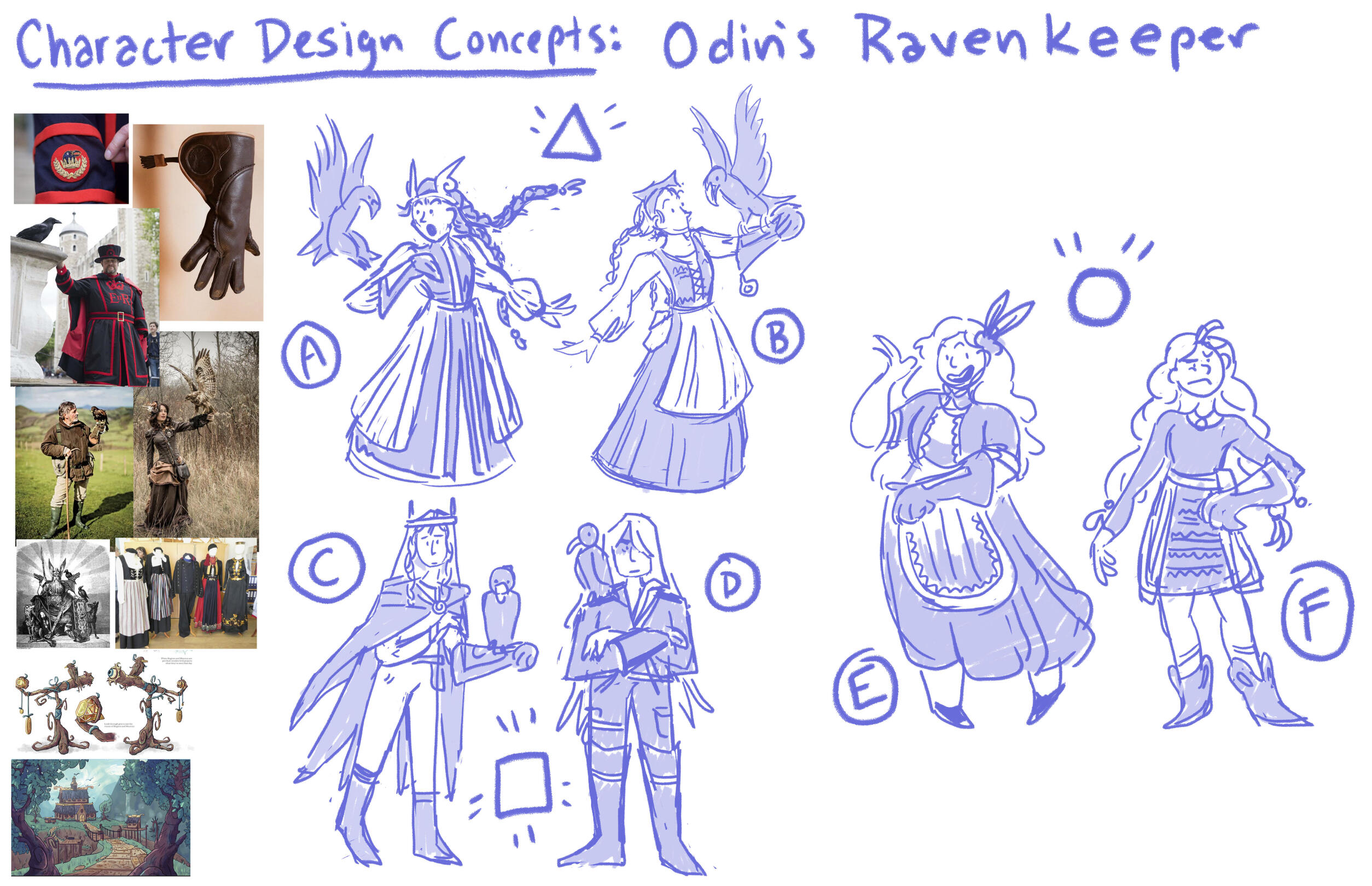
Ravenskeep is a story concept driven by Norse mythology, created as part of a concept art class in 2024. I was tasked with creating a character, environment, and prop for this world, and ended up with a chosen mortal raven trainer, a Midgard vacation home for Odin, and a somewhat-disgusting magic telescope!
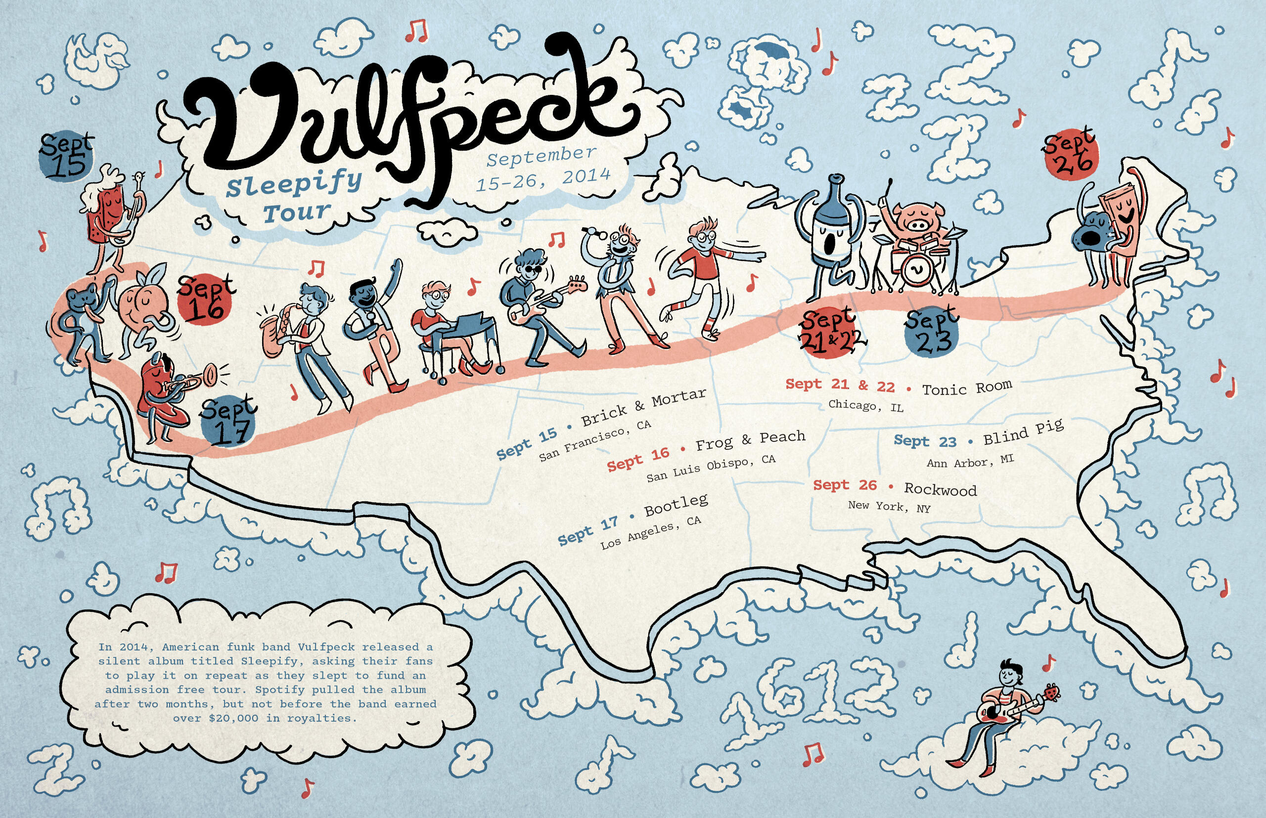
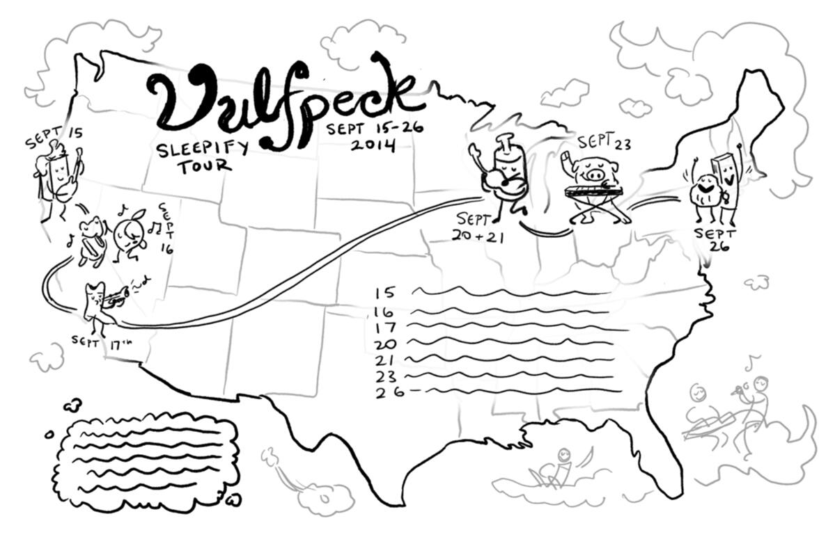
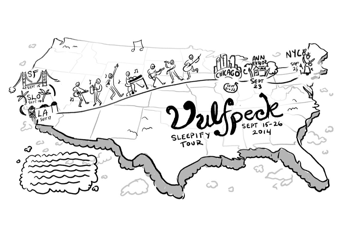
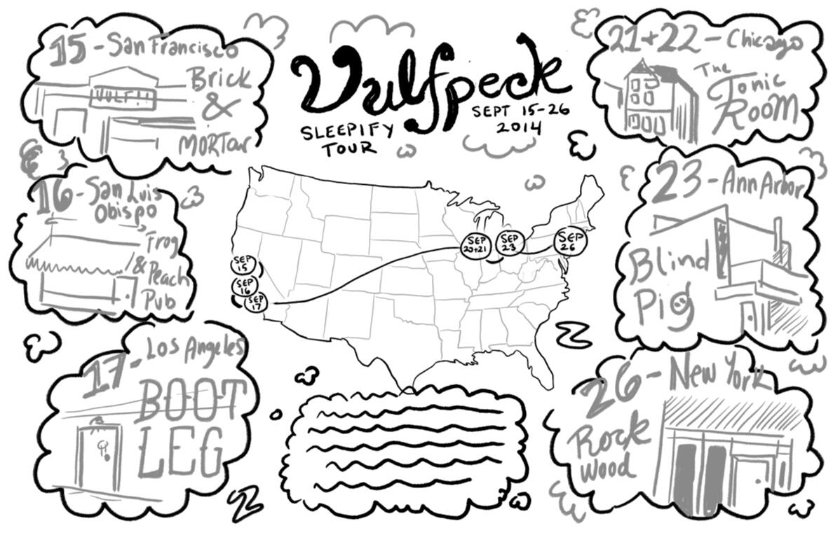
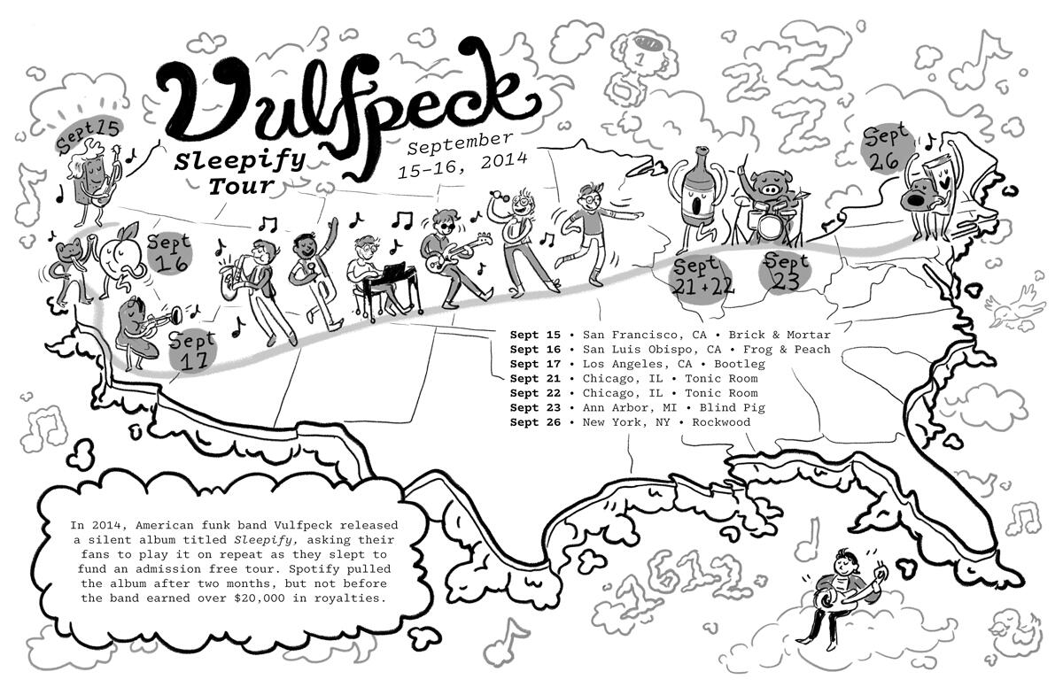
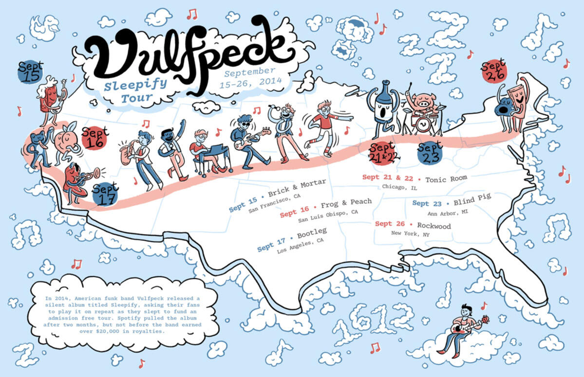
Vulfpeck "Sleepify" Tour Map
11" x 17"; digital; 2024
A fan-made map of Vulfpeck's 2014 Sleepify Tour.
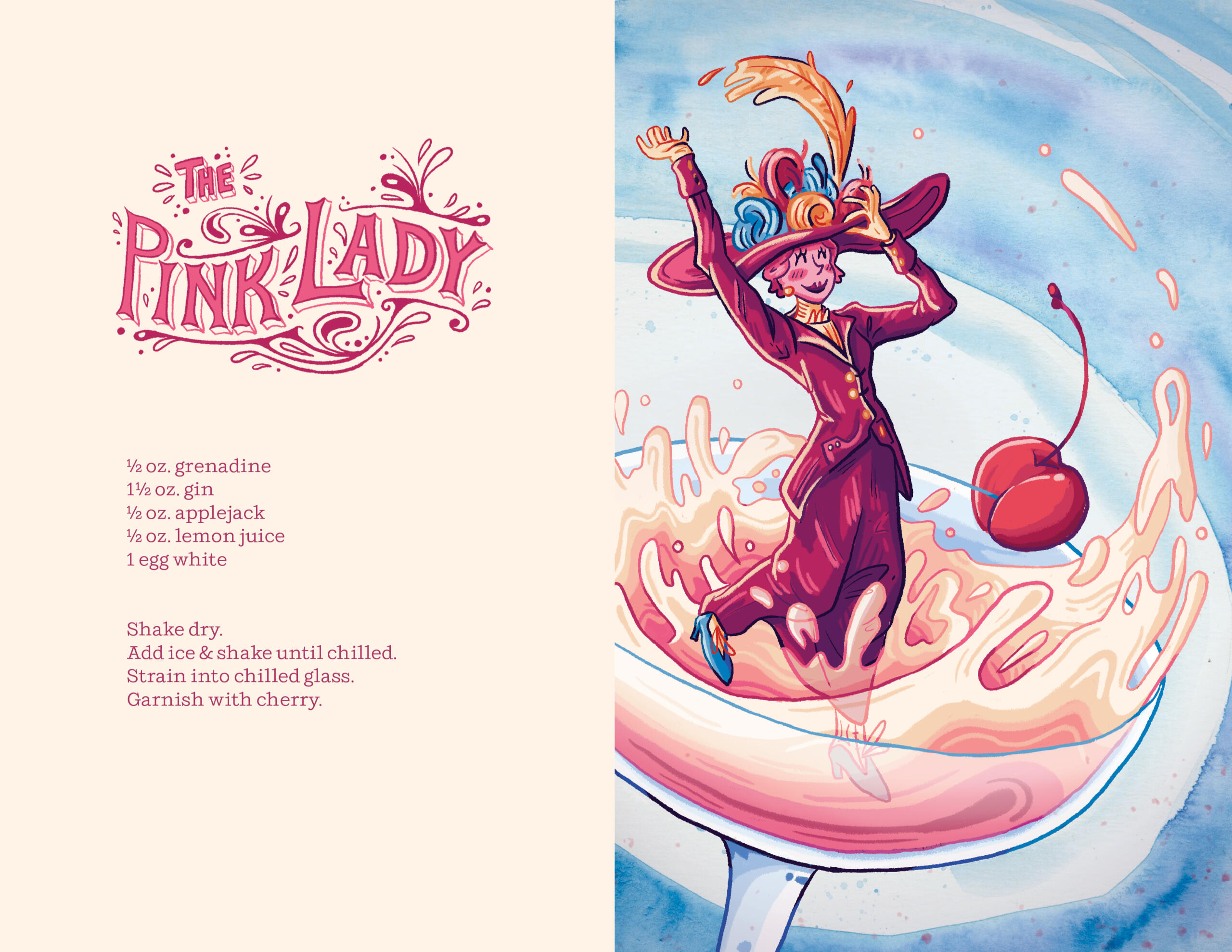
The Pink Lady Cocktail Spread
11" x 8.5" spread; digital & watercolor; 2024
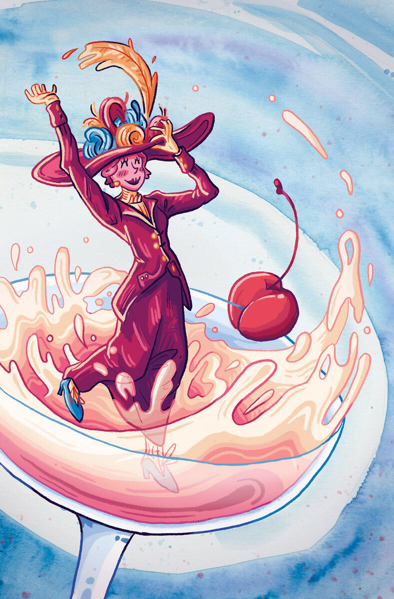
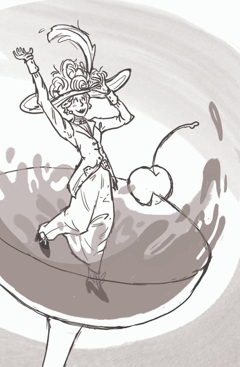
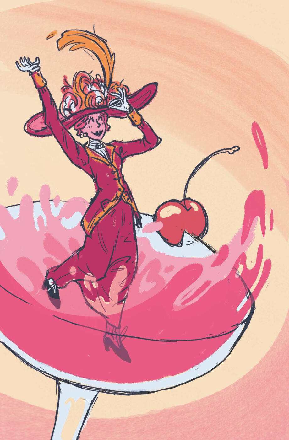
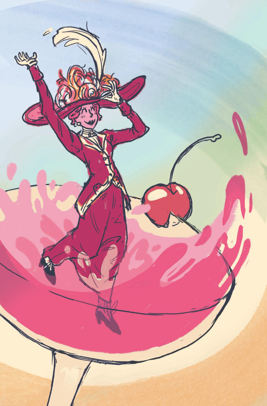
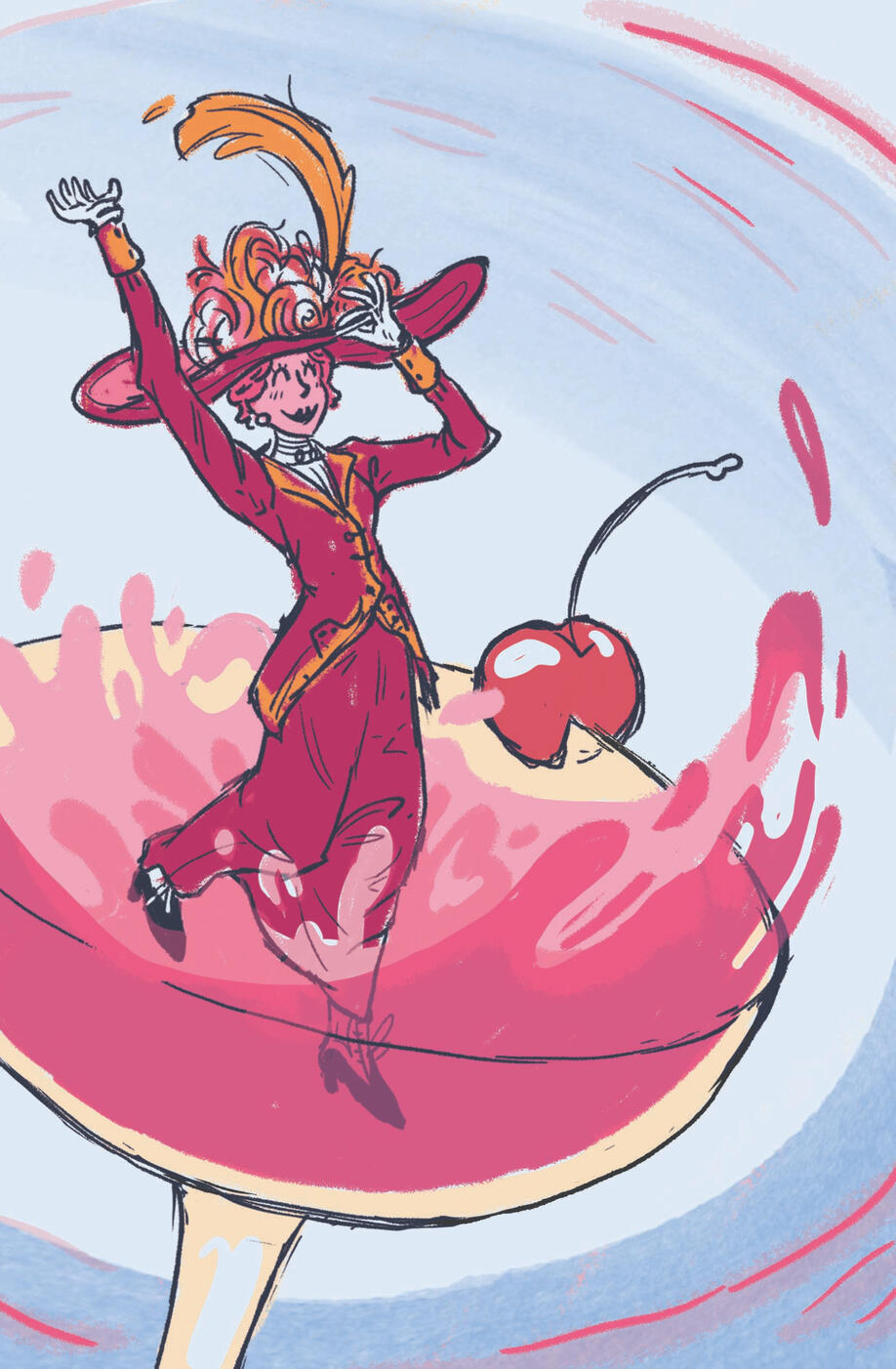
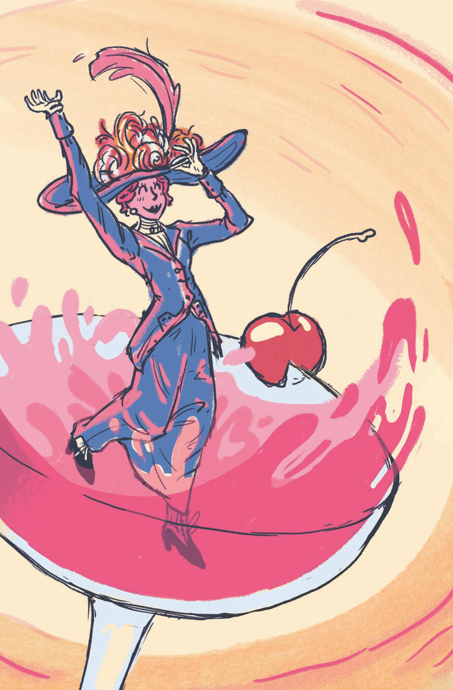
The Milwaukee Institute of Art and Design contributed illustrated cocktail books as freebies at the 2024 ICON12 Illustration Conference, using spreads designed by the Junior class. These designs needed to have an illustrated wordmark, historic recipe, and a full-page illustration using MIAD's colors (magenta, red, orange, and blue). I was fortunate enough to be one of the 16 students selected for the final booklet.
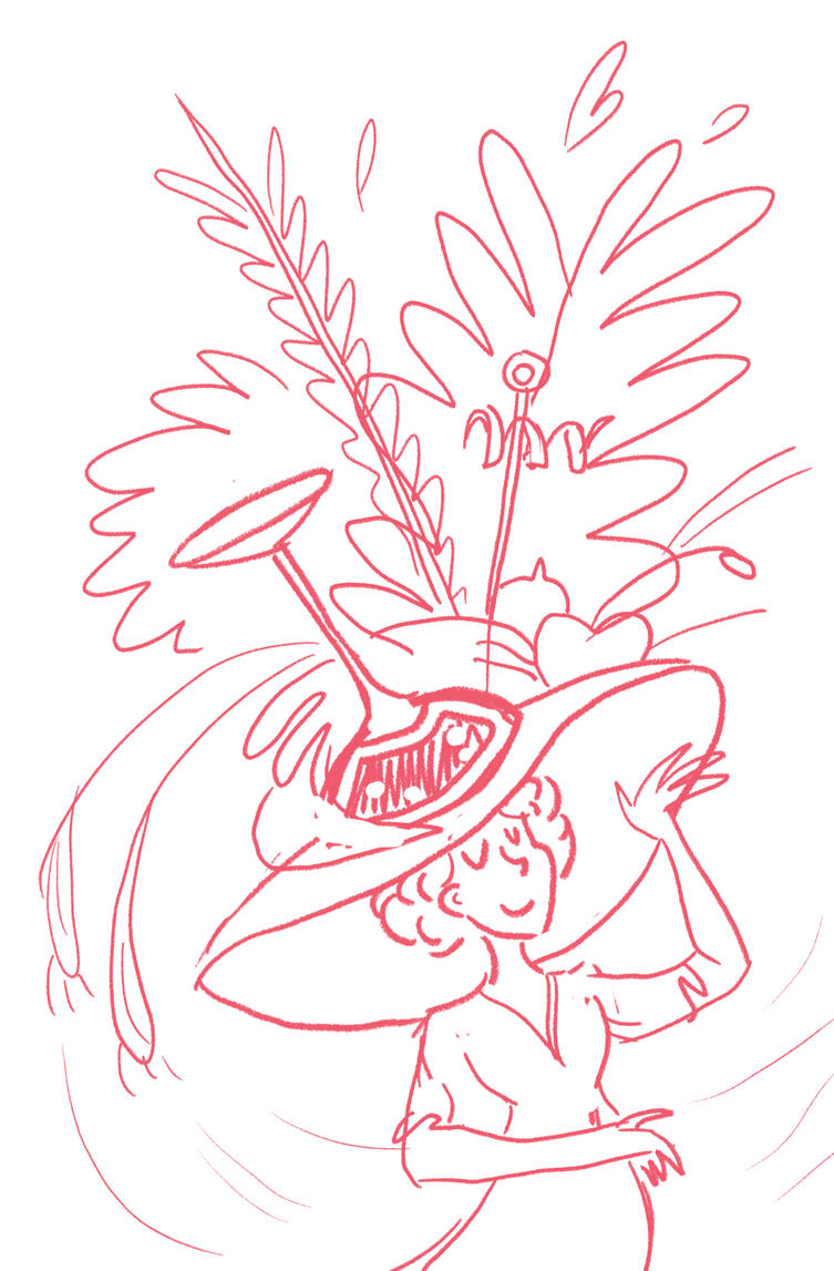
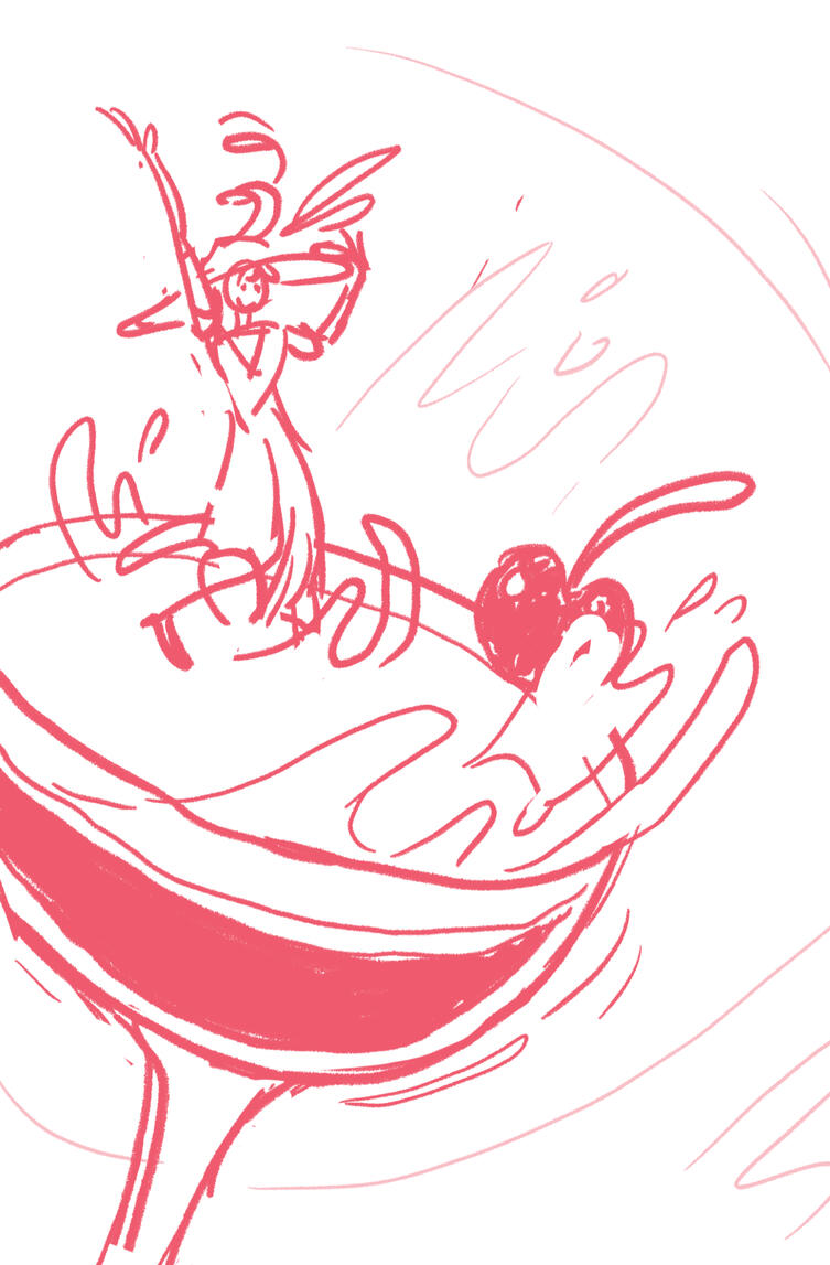
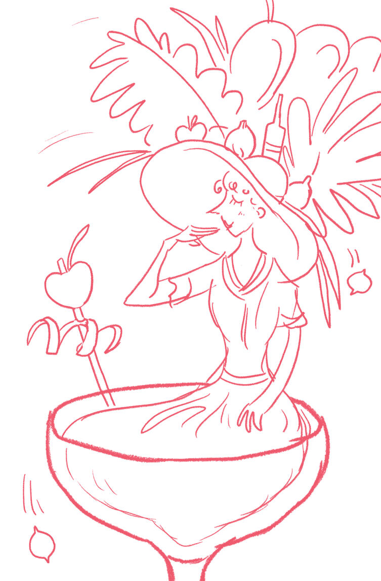
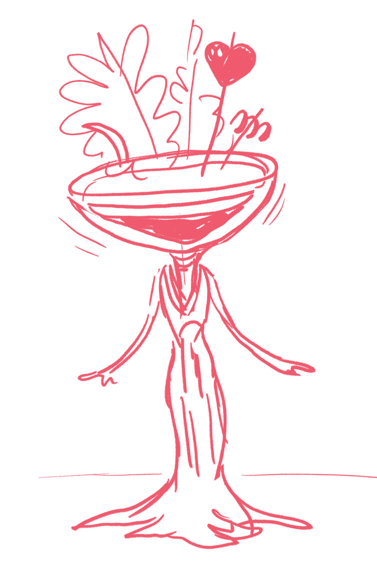
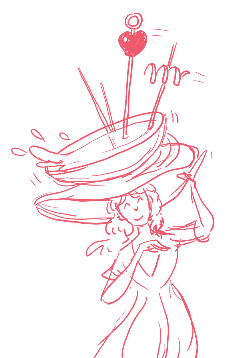
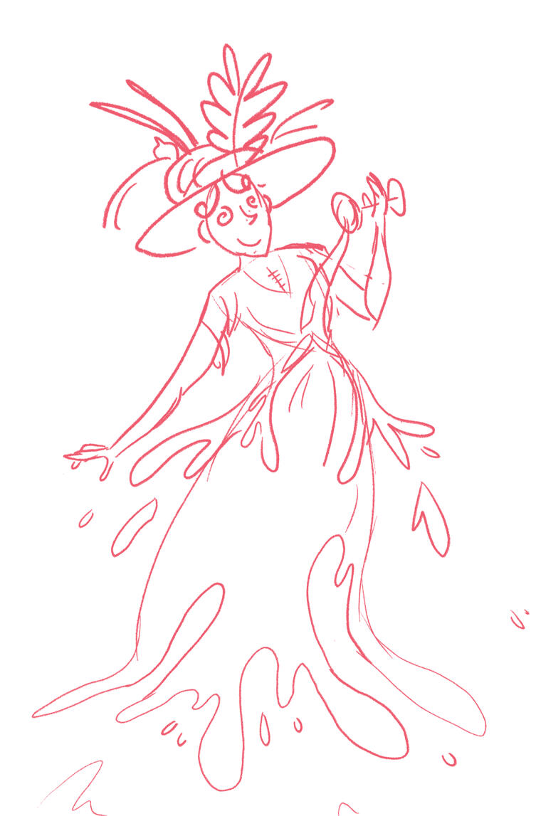
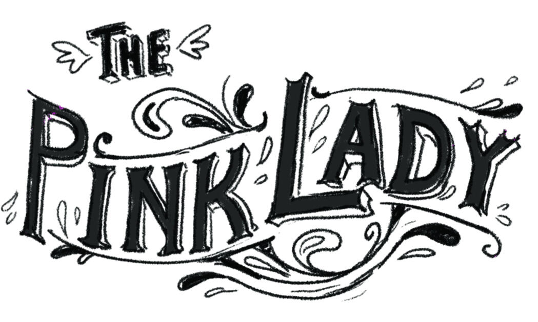
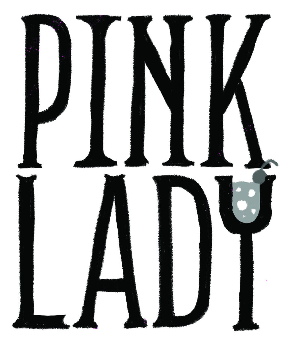
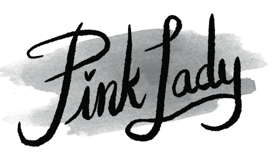
The Pink Lady is a Prohibition-era cocktail. Though some debate remains about its specific namesake and origins, its bright pink, grenadine-fueled color is unquestionable. I created an anthropomorphic Pink Lady to represent the drink, taking inspiration from American 1920s fashion. The wordmark on left is a modern twist on '20s sign lettering.
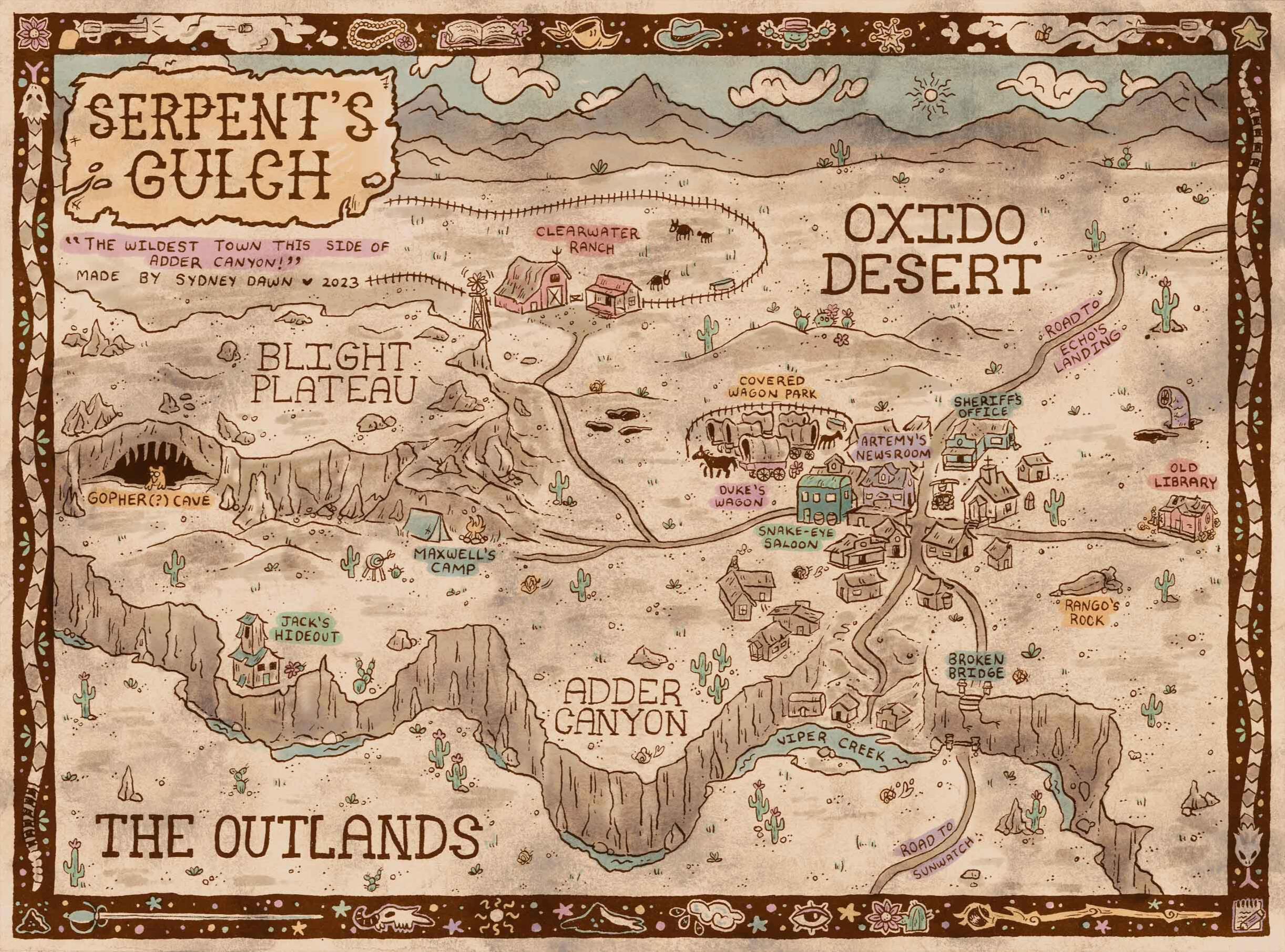
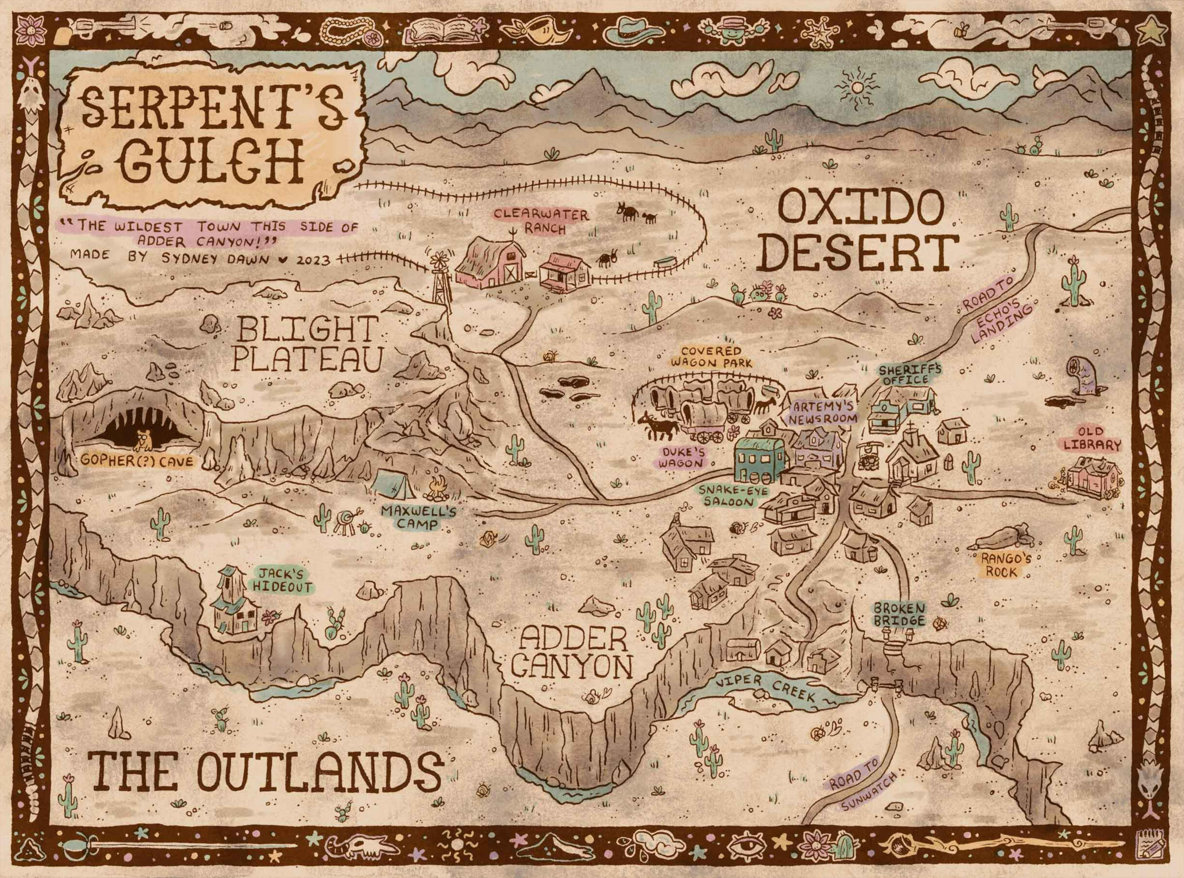
Serpent's Gulch Map
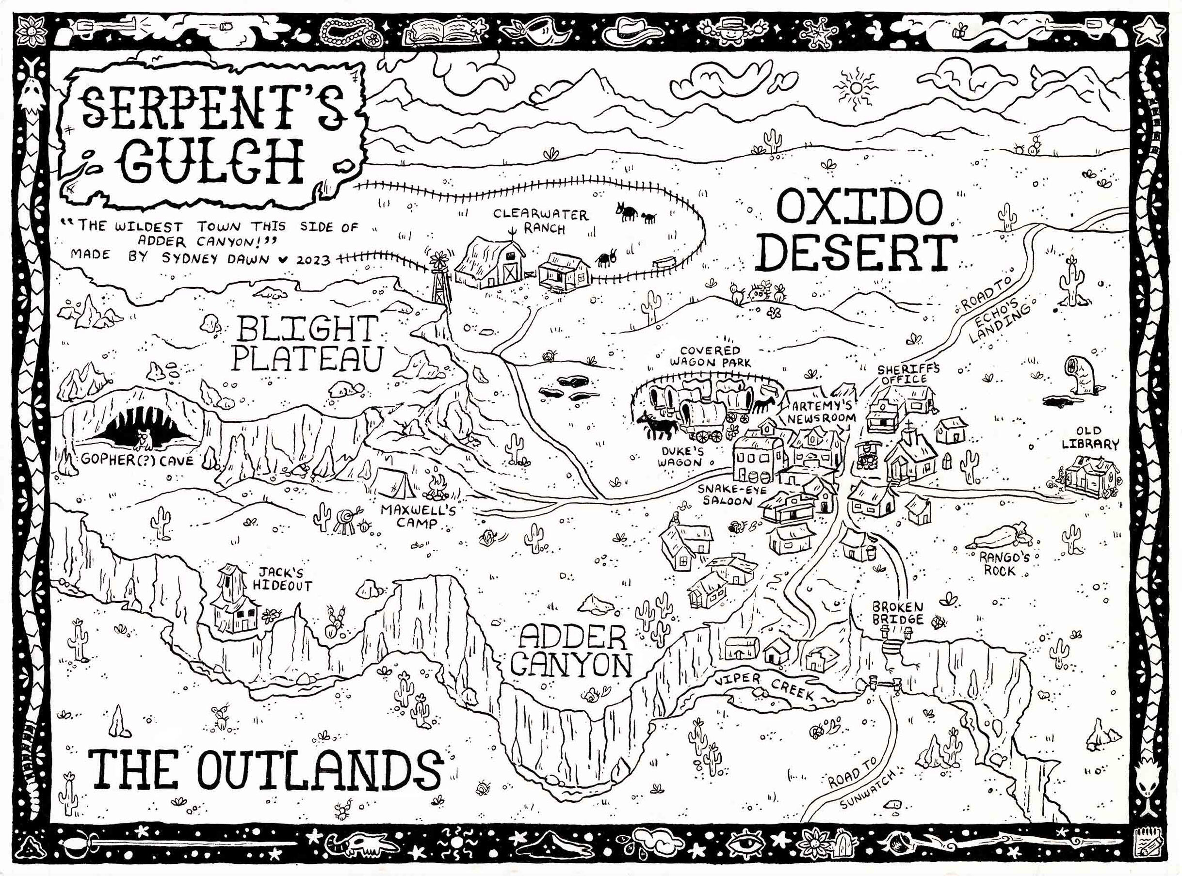
12" x 9"; pen & ink (lines), digital (color); 2023
A map of a magical wild west town, created for a TTRPG (Monster of the Week) campaign I ran for my friends. The linework was done with a dip pen, which I then scanned and rendered digitally.
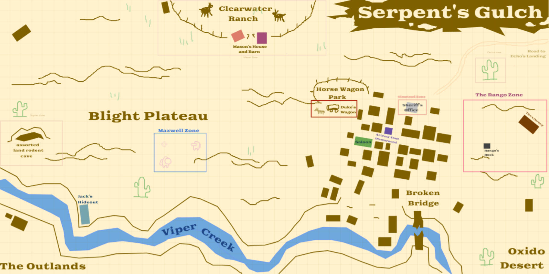
I developed the final map from a collaborative map made in Roll20, an online TTRPG software. The town started out sparce, but as the story continued, my friends and I added more features (and silly doodles!)
Saint George's School Fundraising Illustrations
8.5" x 11" full page illustrations; digital & watercolor; 2024
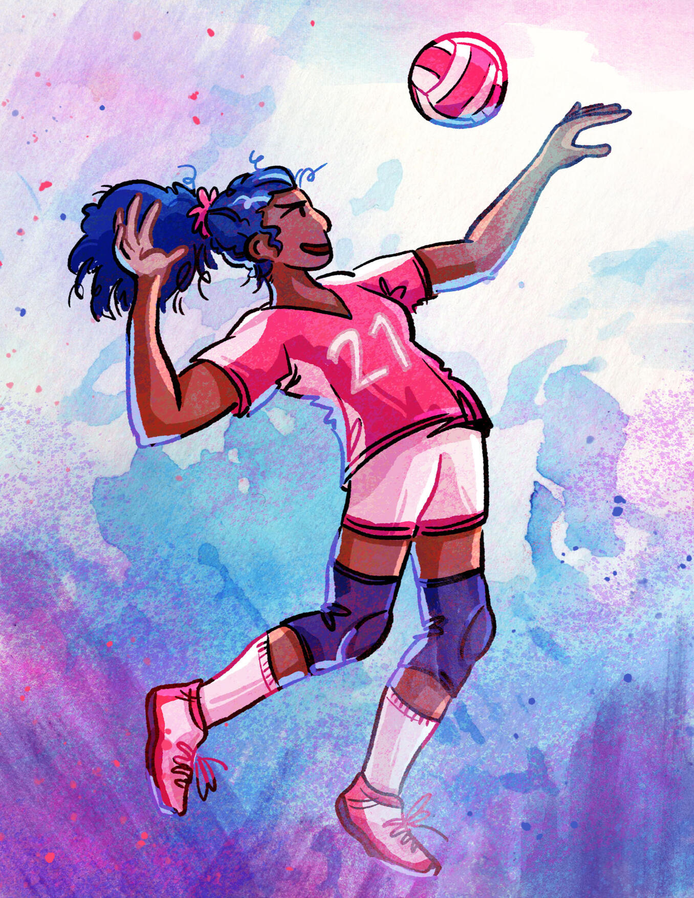
Saint George's School (Spokane, WA) hired me to create three full page illustrations to use in fundraising efforts for the 2024-2025 school year.I used their motto, "Inspiring scholars, athletes, and artists to serve and lead others", as direction for the set. They also requested to see a student from each of their three schools: Lower (K-5), Middle (6-8), and Upper (9-12).
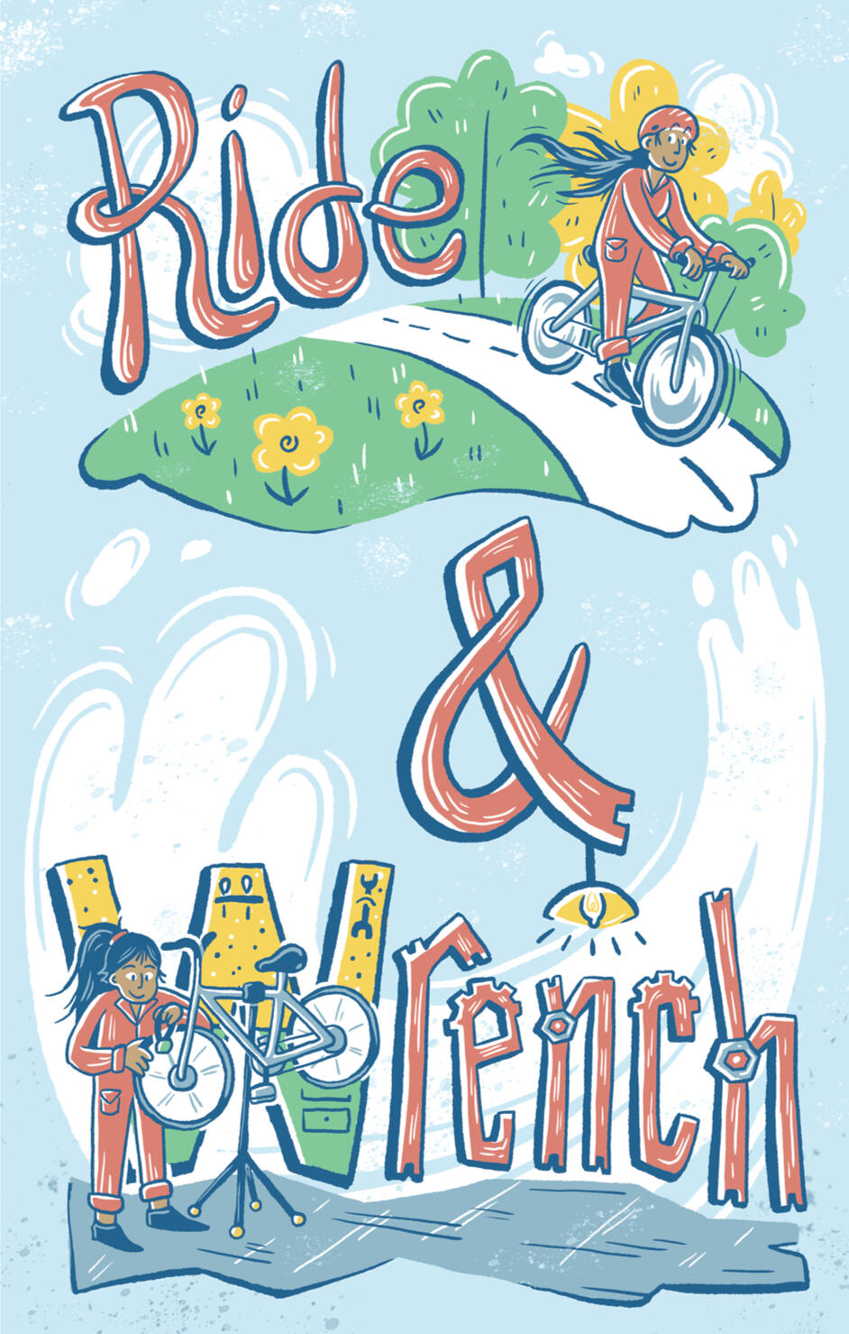
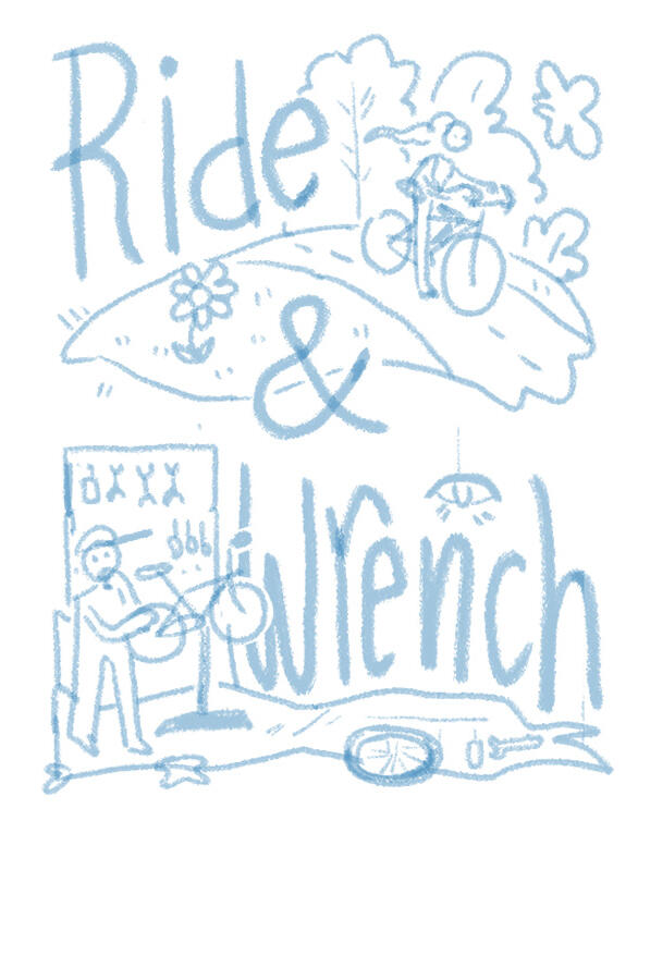
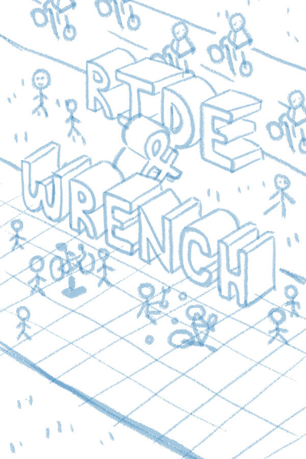
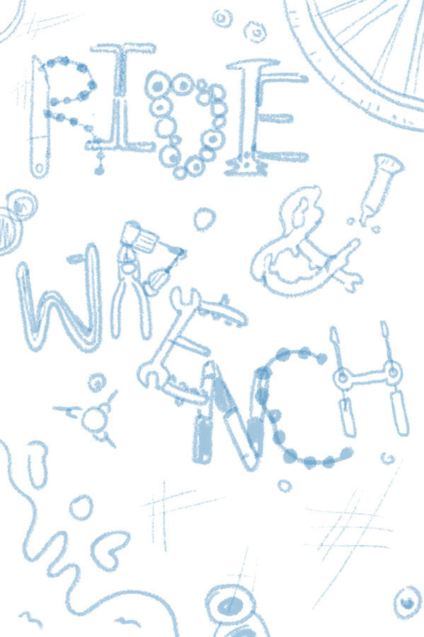
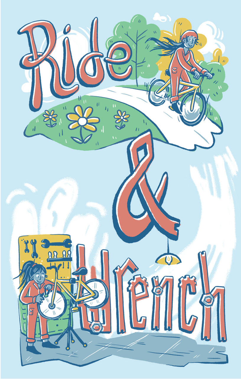
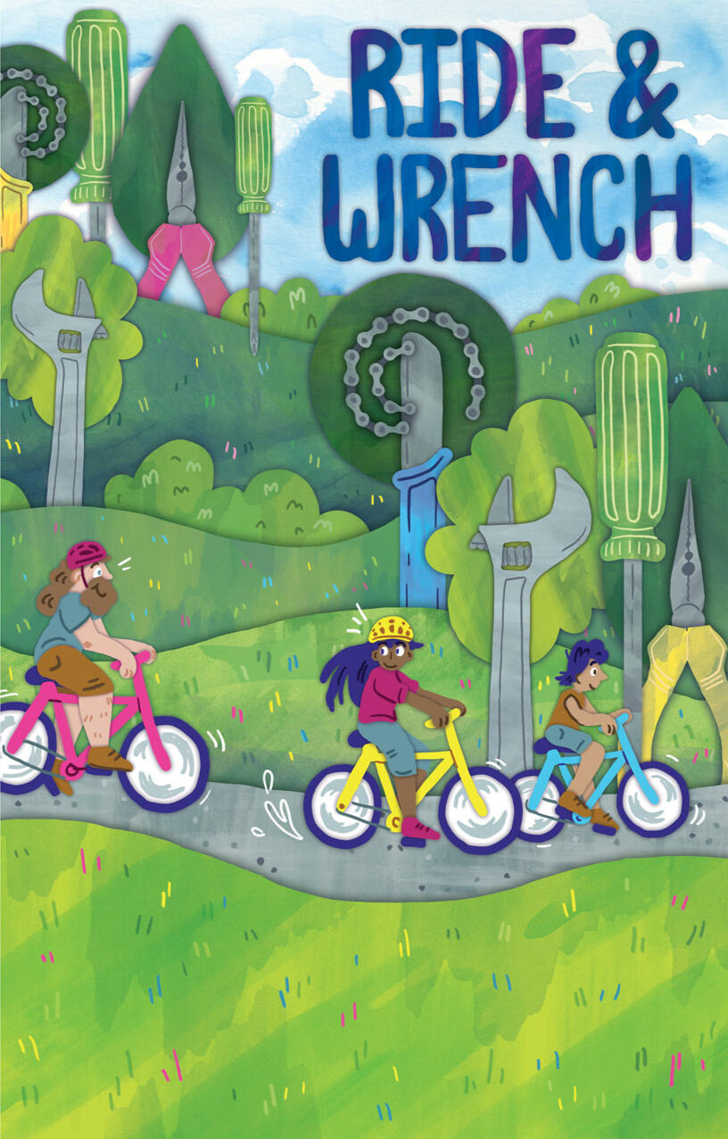
"Ride & Wrench"
Trek Collaboration
24" x 36"; digital; 2023
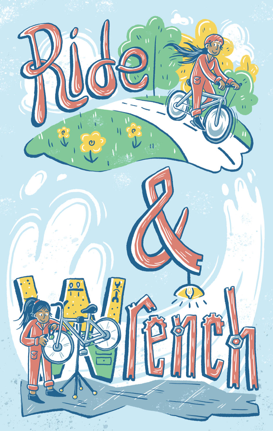
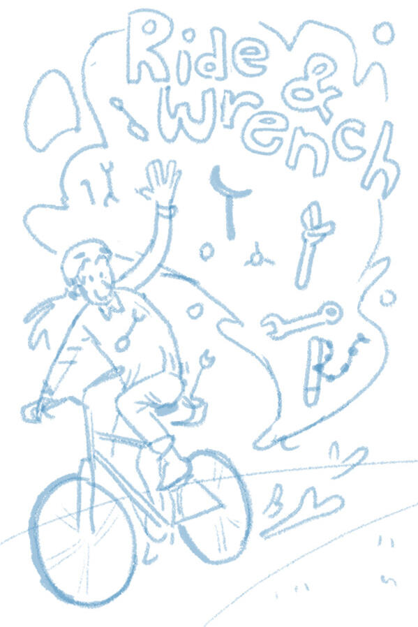
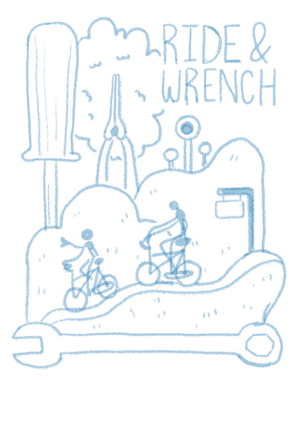
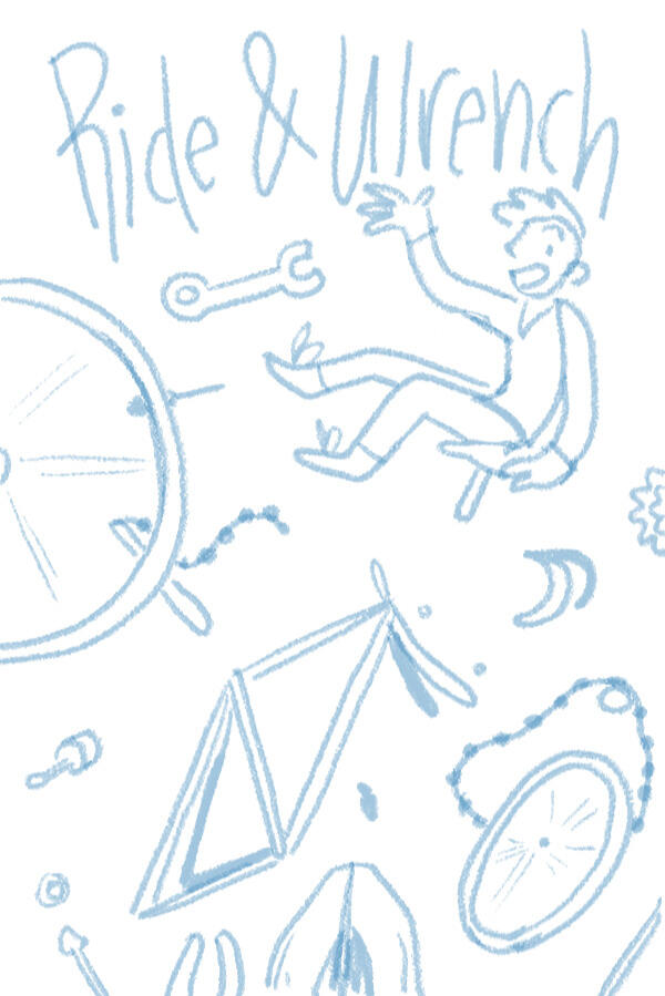
This piece was one of 20 finalist poster designs in a collaboration between Trek Bikes and the Milwaukee Institute of Art & Design. Each third-year illustration student was asked to make a promotional poster for a Trek sponsored bike ride. I was assigned the theme "Ride & Wrench," a dual ride and bike maintenance event targeted towards new and younger riders.
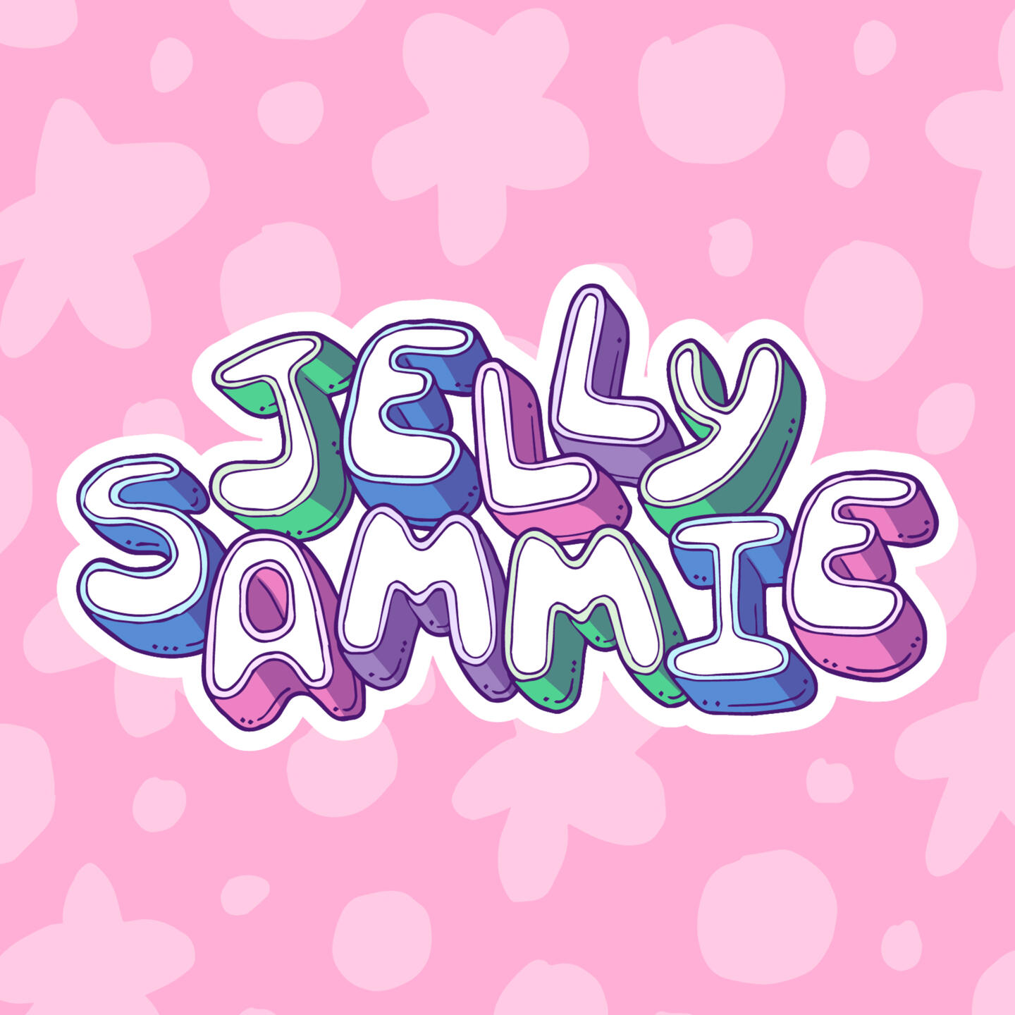
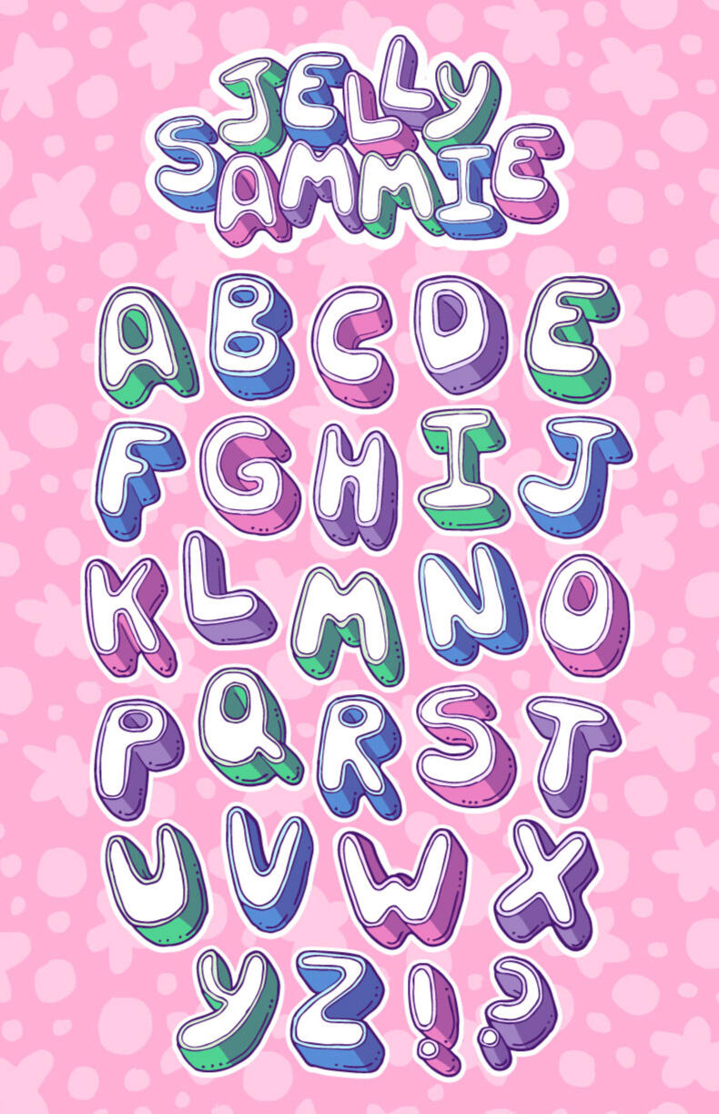
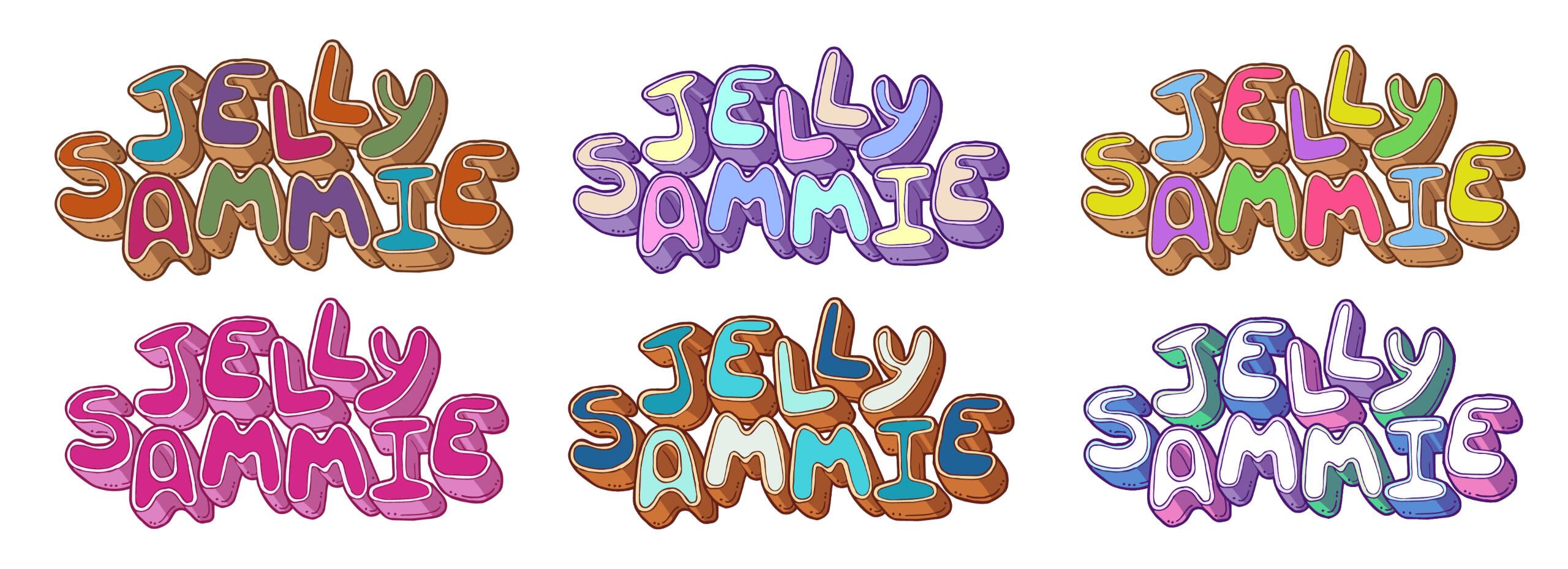
Jelly Sammie
Vectorized Typeface; 2023
Jelly Sammie is a hand-rendered, 3D typeface. Its wobbly, bottom-heavy forms were inspired by its namesake. It is best used off the baseline and with bright, vibrant colors.
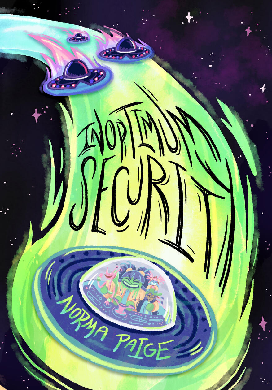
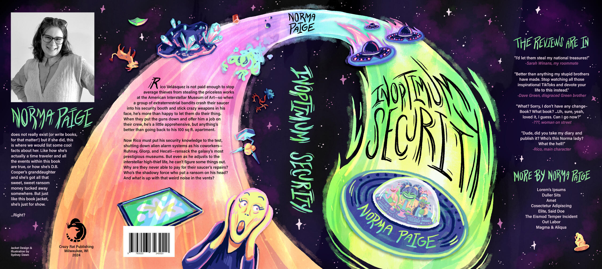
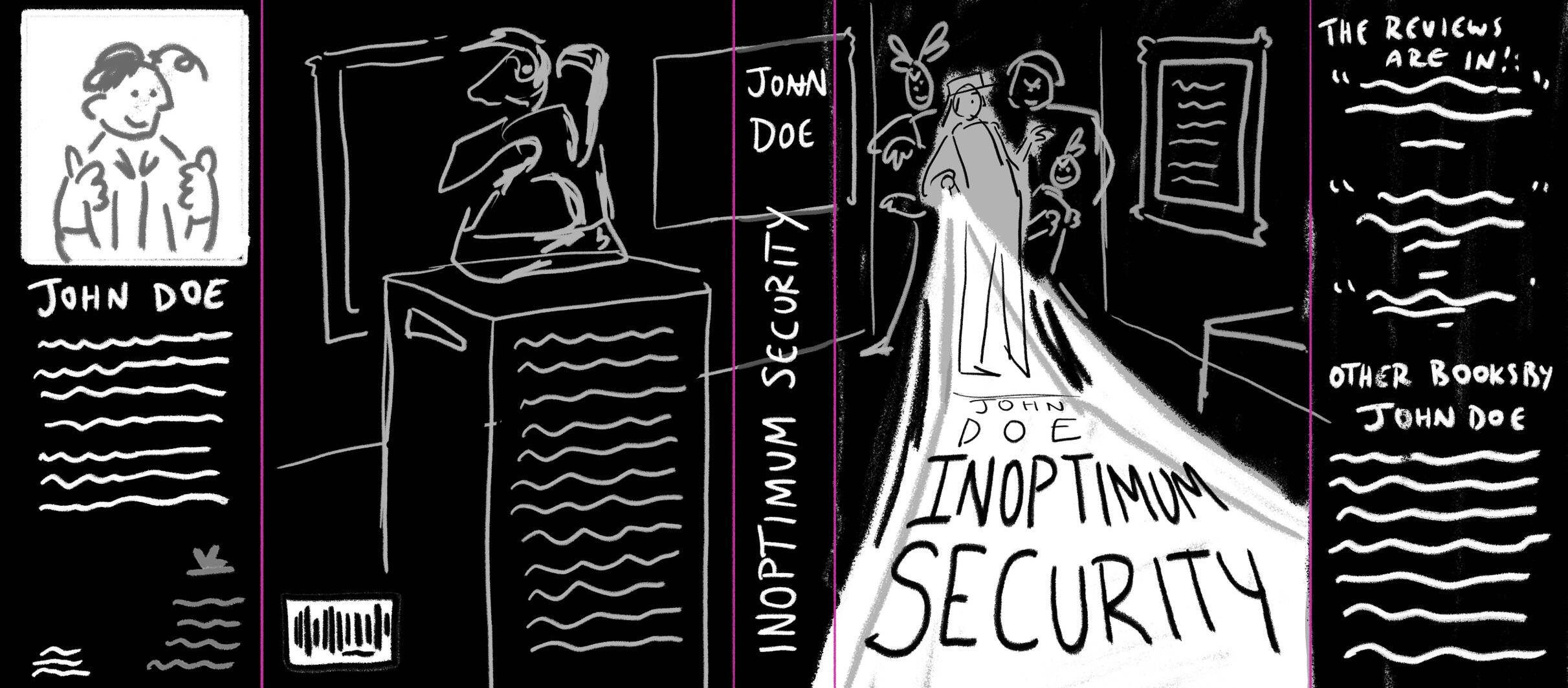
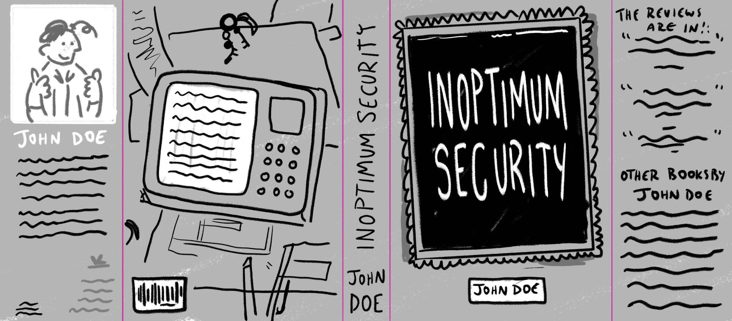
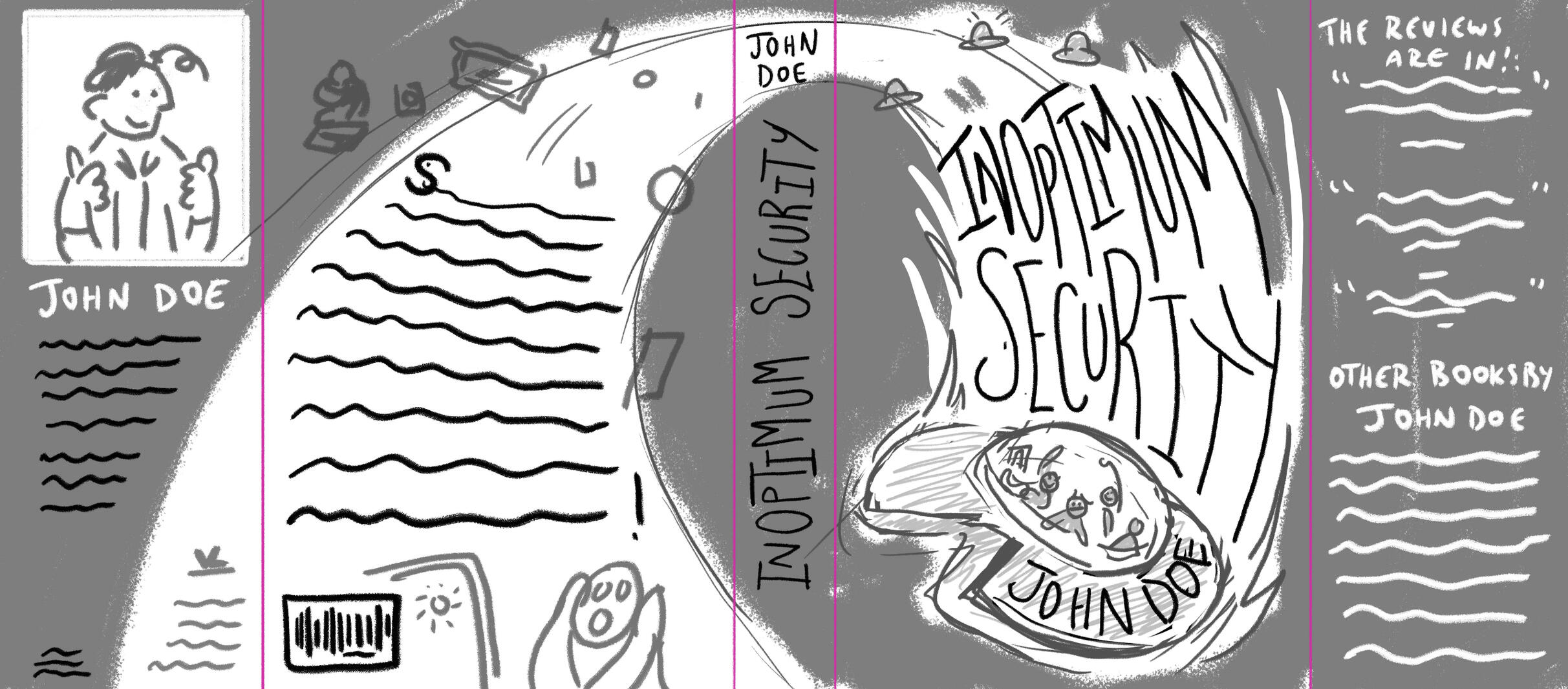
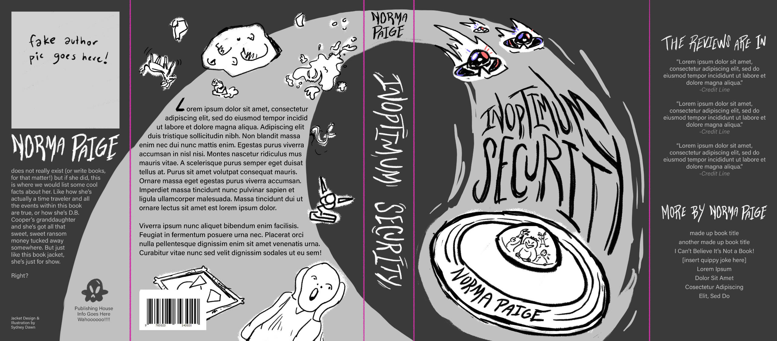
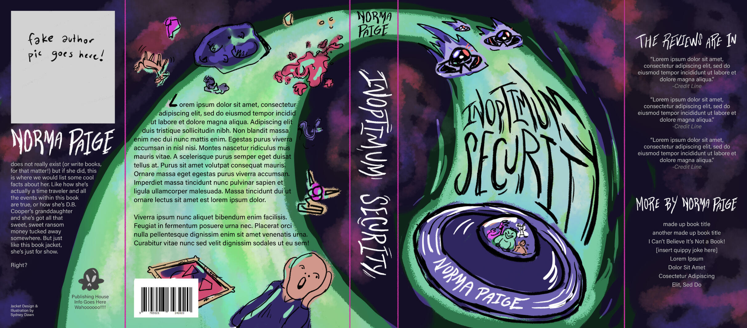
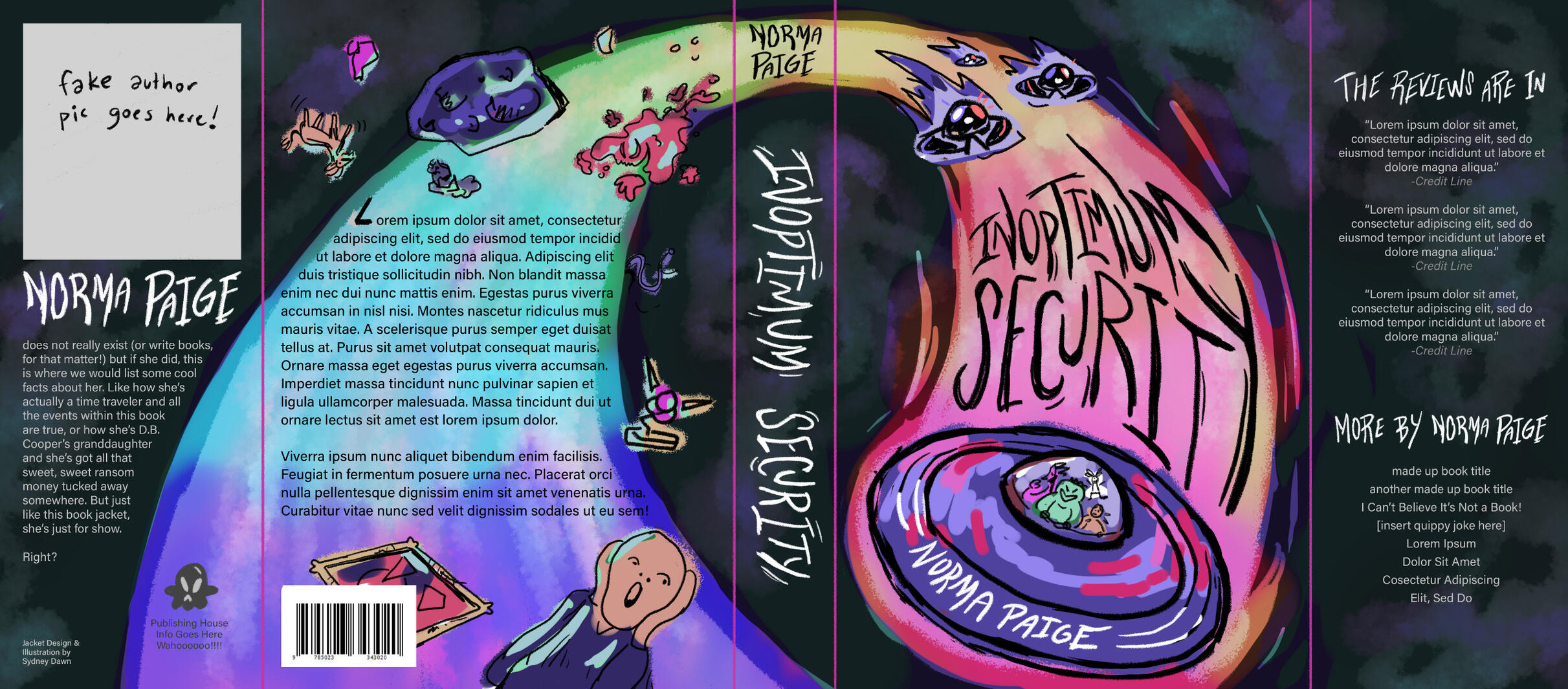
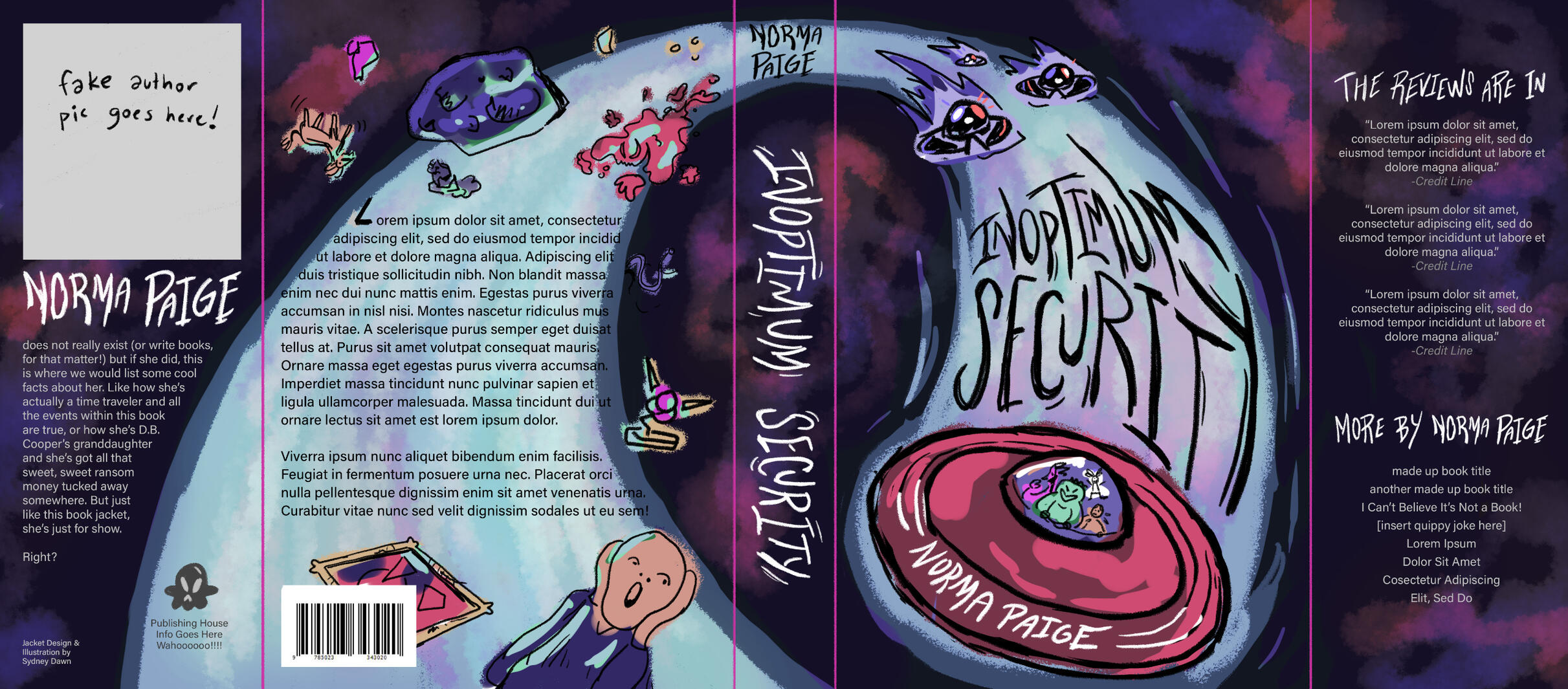
Inoptimum Security
21.5" x 9.5" wrap-around dust jacket; digital; 2024
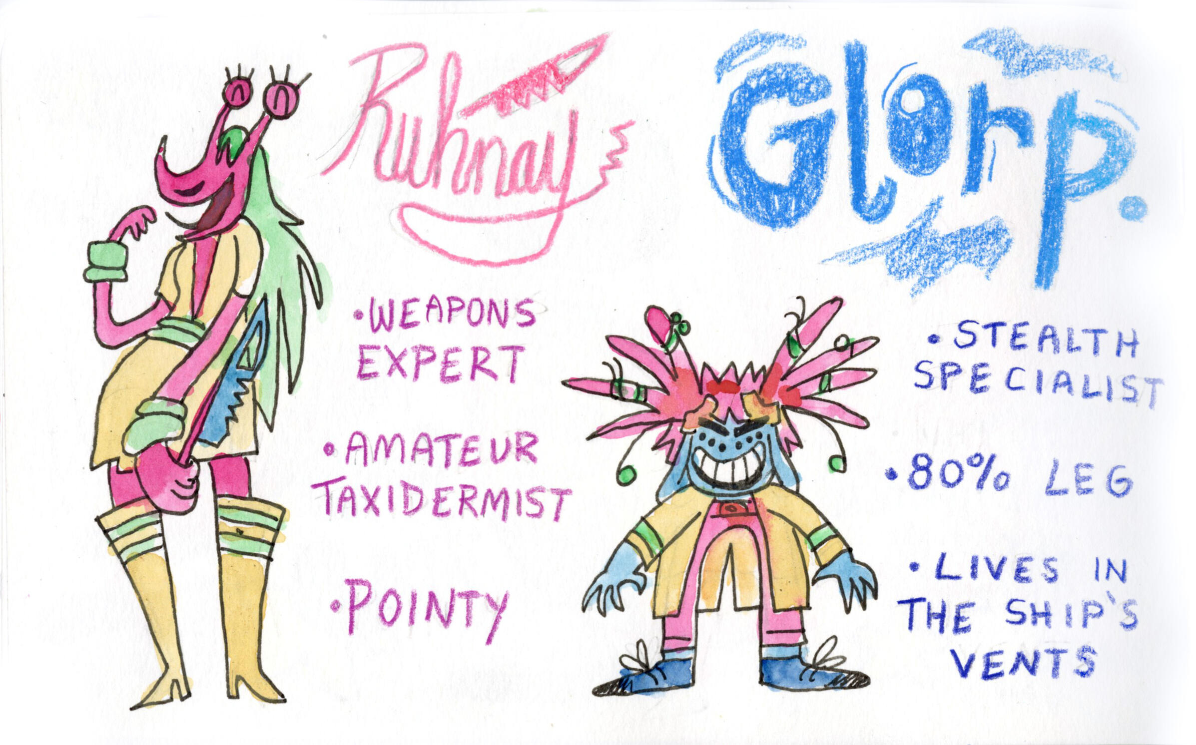
Inoptimum Security is a (fake) YA sci-fi novel about a group of interstellar art thieves.
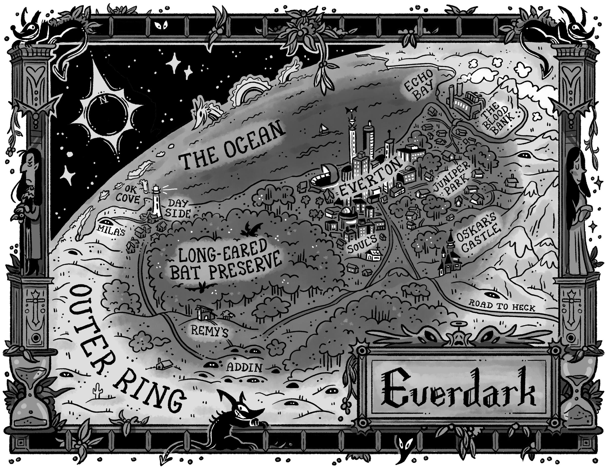
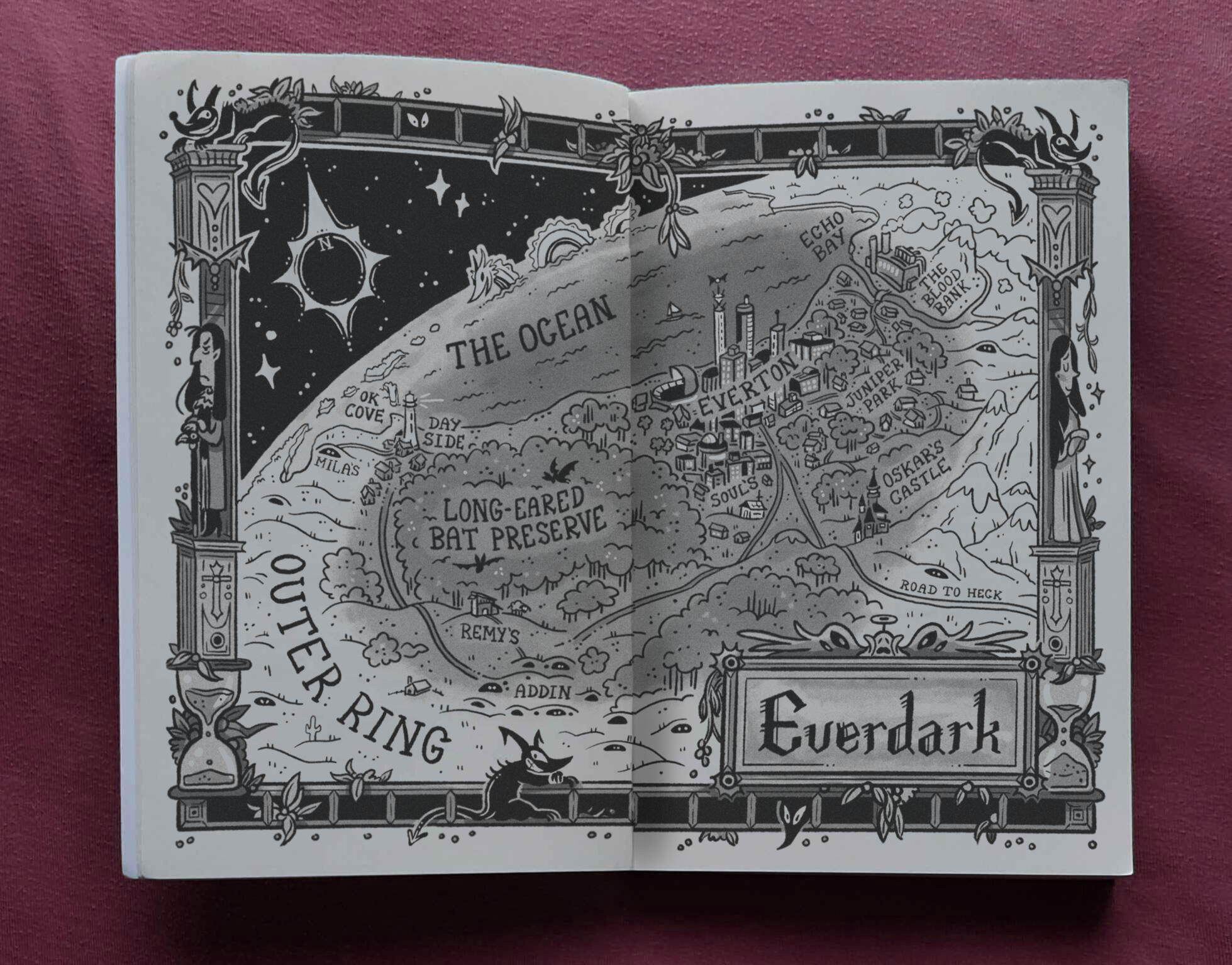
Everdark: Eternal Eclipse
10" x 8"; digital; 2024
An interior map for a hypothetical YA fantasy:"After an unfortunate series of asteroid strikes, the spin of the planet Terra synced with the Sun, creating hemispheres of permanent day and night. This sucked fang for everyone involved—except for the Vampires of Everdark, the ghoulish fiends who thrive in the eternal eclipse beneath the Moon."
Hey, I'm Sydney!
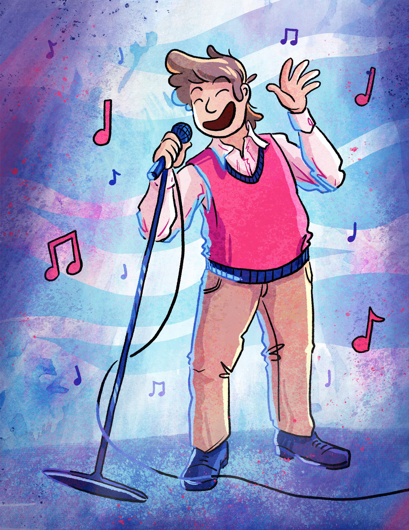
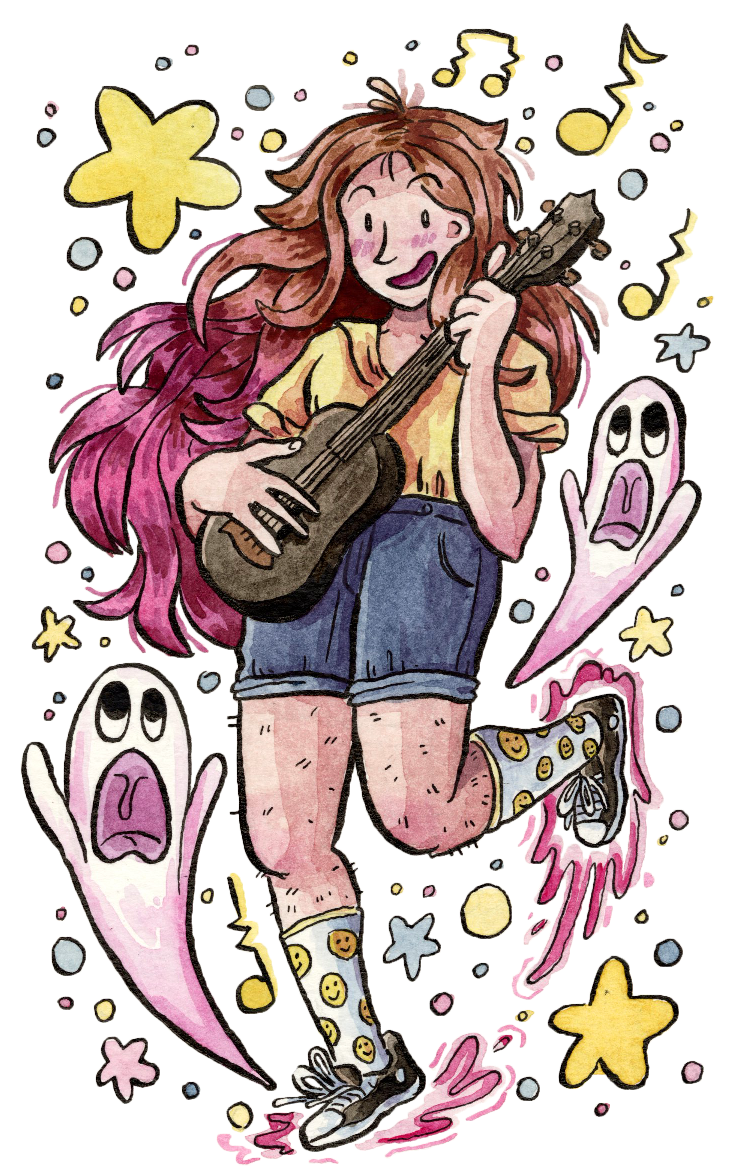
I’m an illustrator & designer who blends digital and traditional methods to make bright and whimsical pieces. I have a passion for zines, maps, and hand-rendered typography. I'm a recent graduate of the Milwaukee Institute of Art & Design, where I earned my BFA in Illustration with a minor in Communication Design—but now I'm living in the Inland Northwest with my best friend, Bigfoot.When I’m not working, I’m usually writing, cross-stitching, playing D&D, thinking about Ace Attorney, or poorly strumming ukulele chords while “singing” (I’ve also heard it described as “screeching”, “calling whales”, and “summoning banshees from the underworld”.
I suppose it's up to debate!)If you have a project that you’d like my help bringing to life, please reach out at contact@sydneydawned.com!
